Two established organisations working in education and youth development were coming together to create a stronger organisation capable of creating greater impact. The challenge wasn't simply to create a new name and identity. It was to unite two respected organisations around a shared vision for the future while preserving the values that made each special.
We created
- Brand Strategy
- Naming
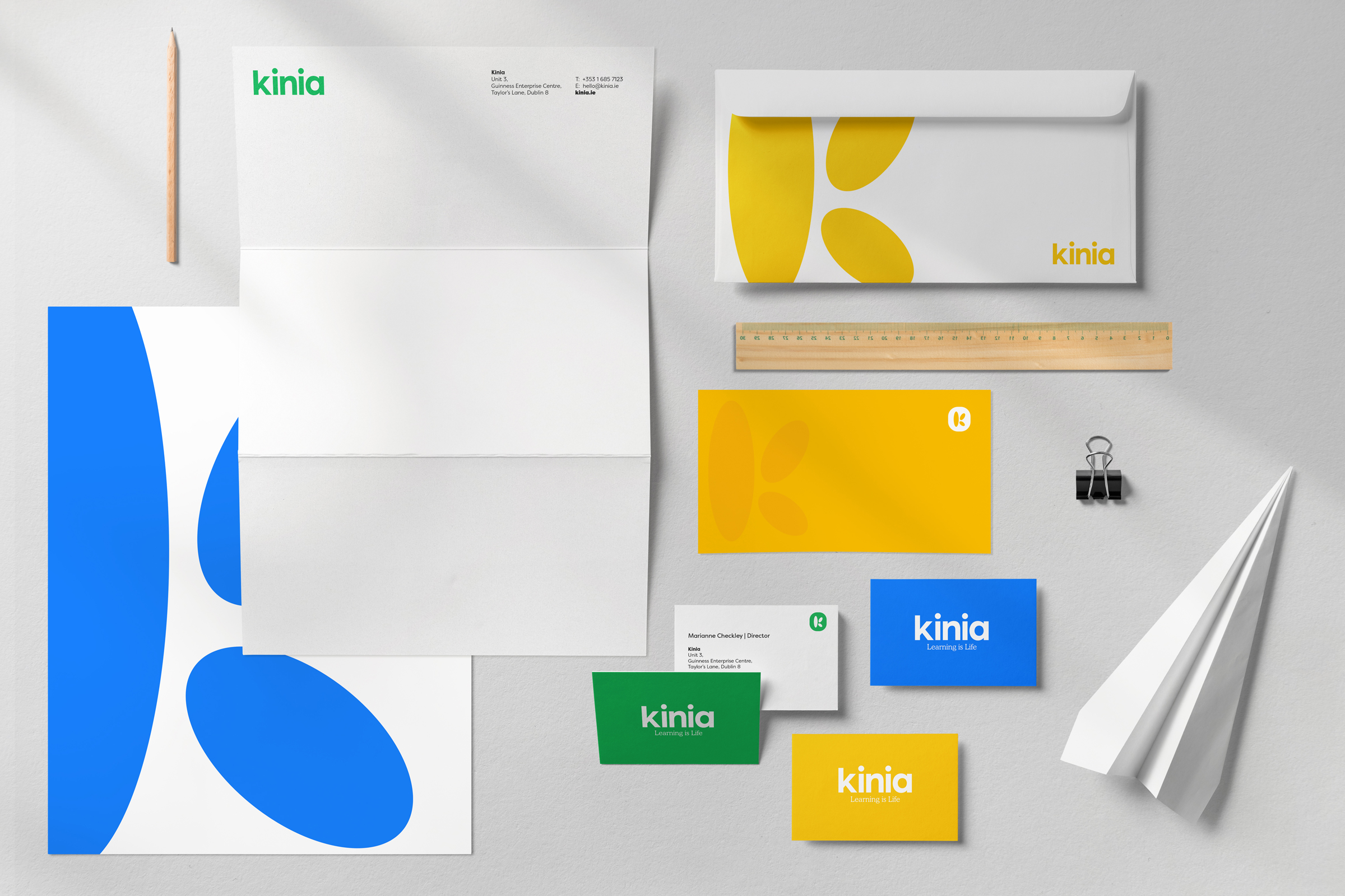
- Brand Identity
- Design & Art Direction
The Insight
As we worked through an extensive programme of research and discovery, one idea continually emerged.
Learning creates opportunity.
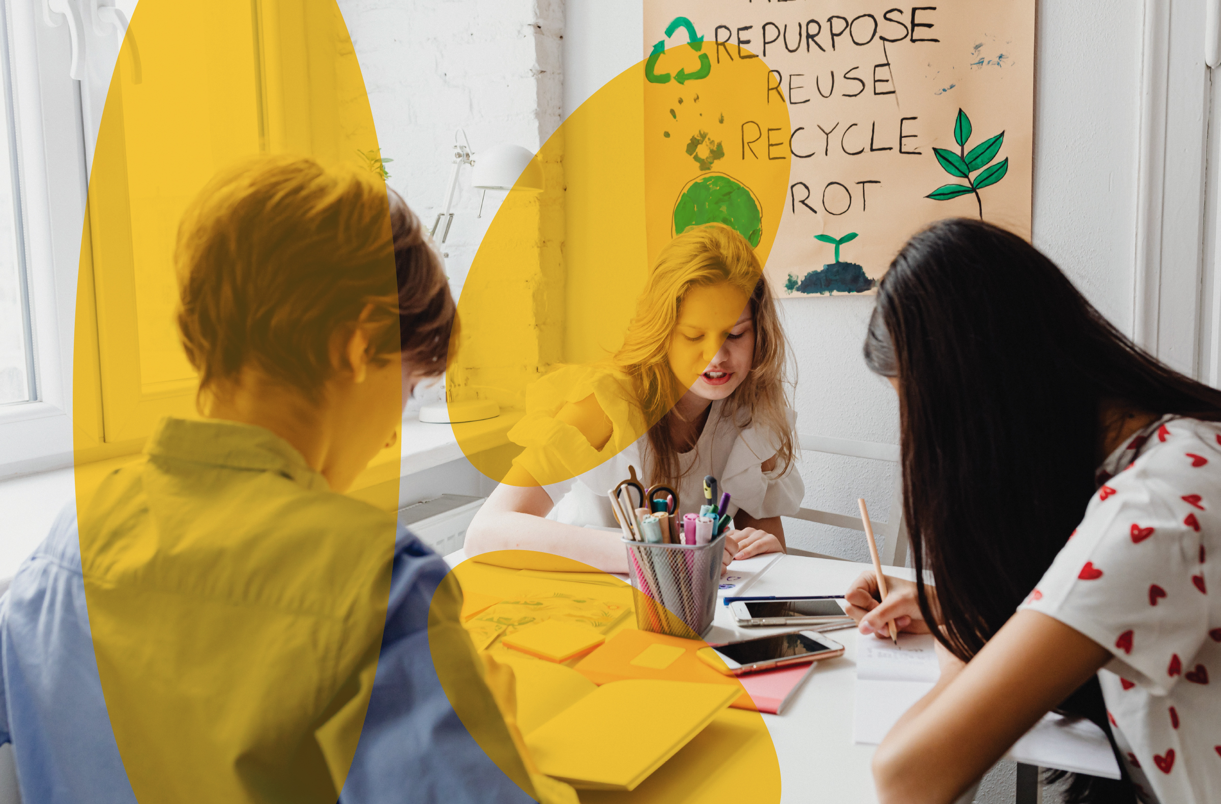
It builds confidence, unlocks potential and creates a ripple effect that can influence entire communities for generations.
The organisations shared a belief that every child and young person should have access to those opportunities.
That belief became the foundation for the new brand.

The Idea
The positioning evolved into a simple but powerful thought:
Collectively creating opportunity for children, young people and their communities.
From this came a new name, Kinia, and a brand purpose that captured the organisation's ambition in three simple words:
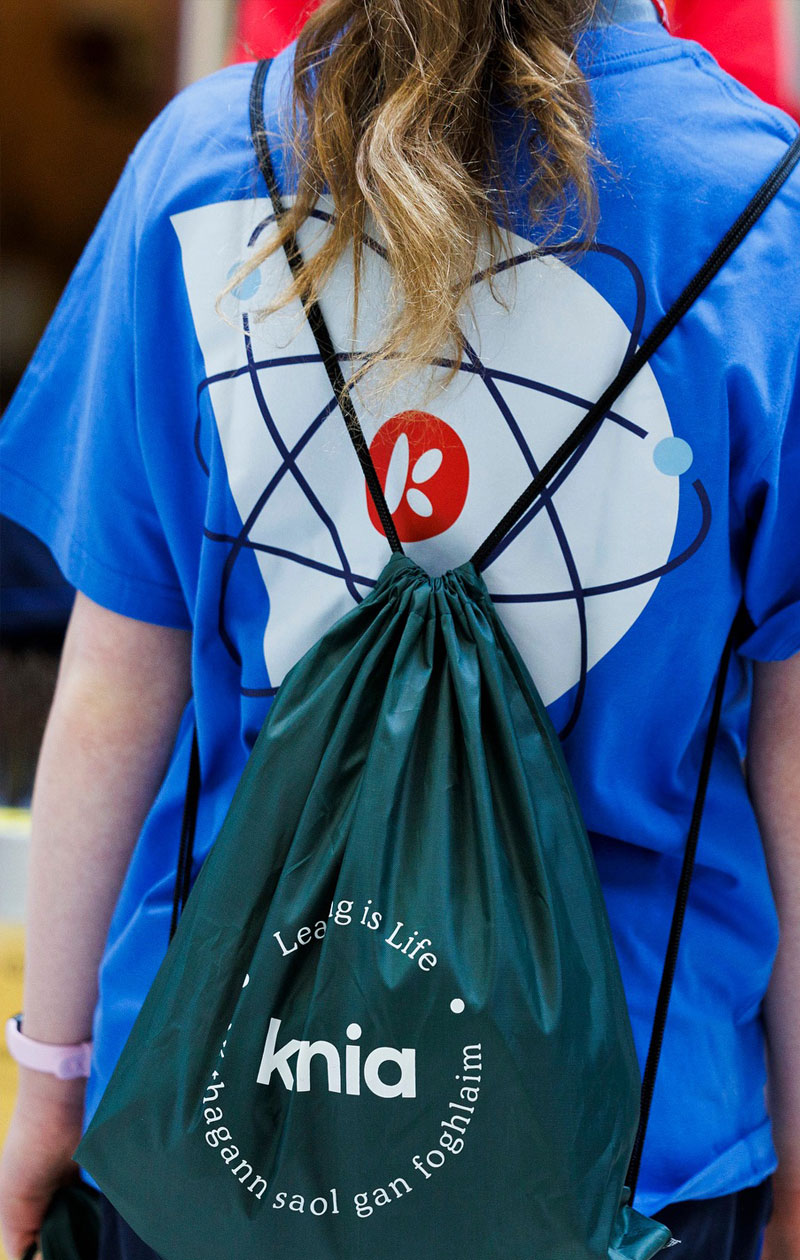
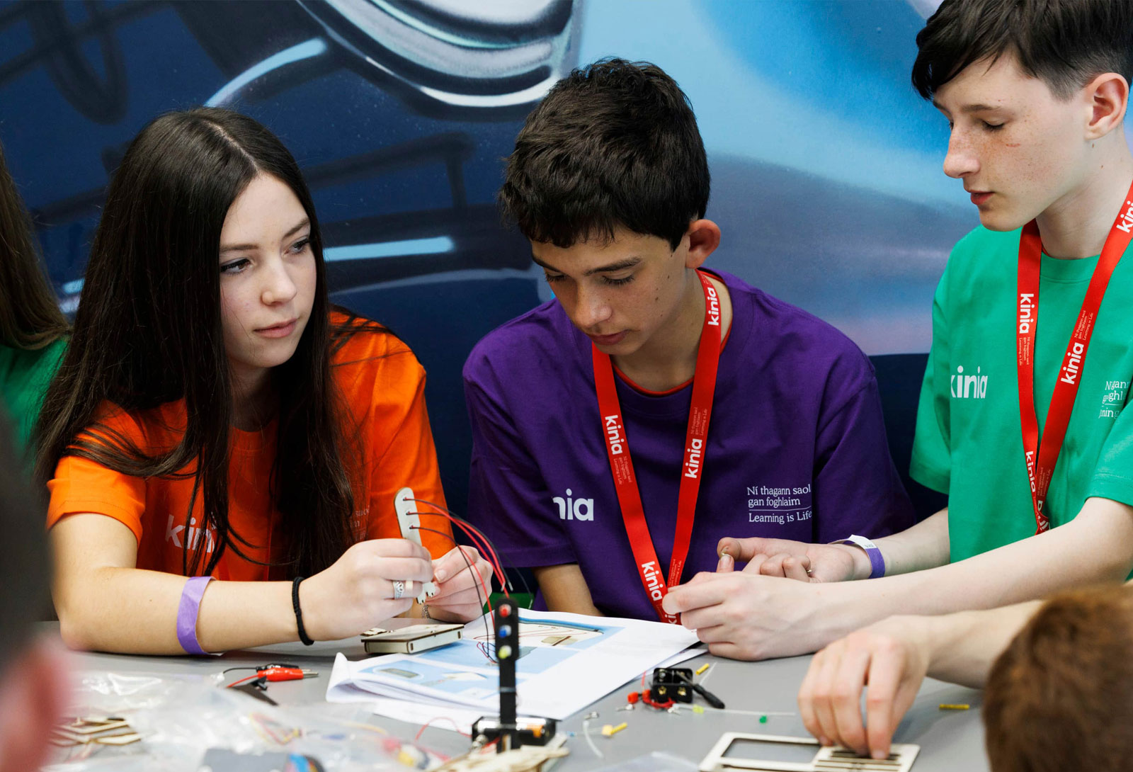
Learning is Life.

The Outcome
The result was more than a new organisation.
It was a shared platform for change.
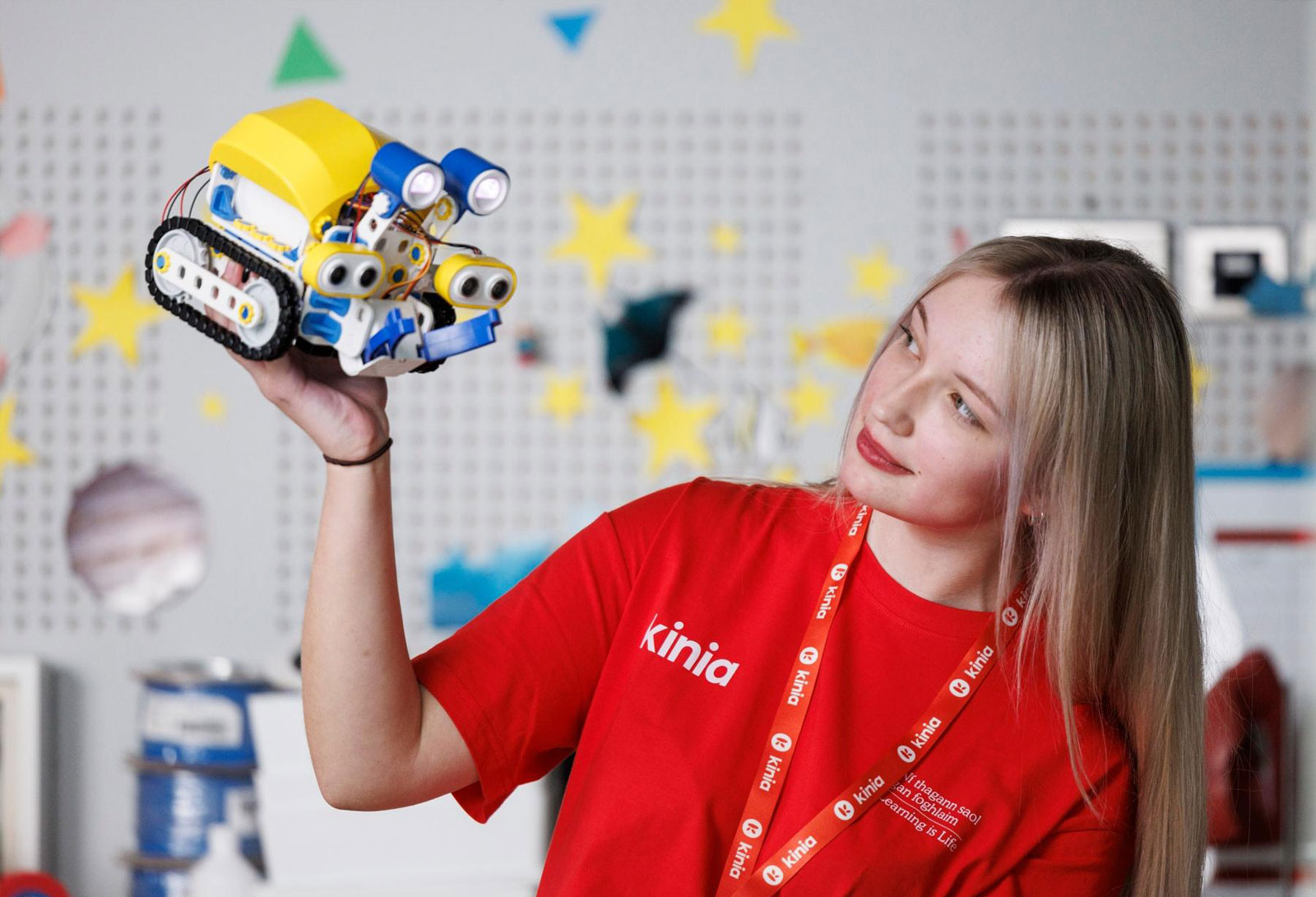
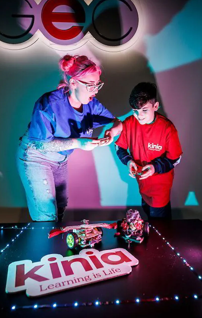
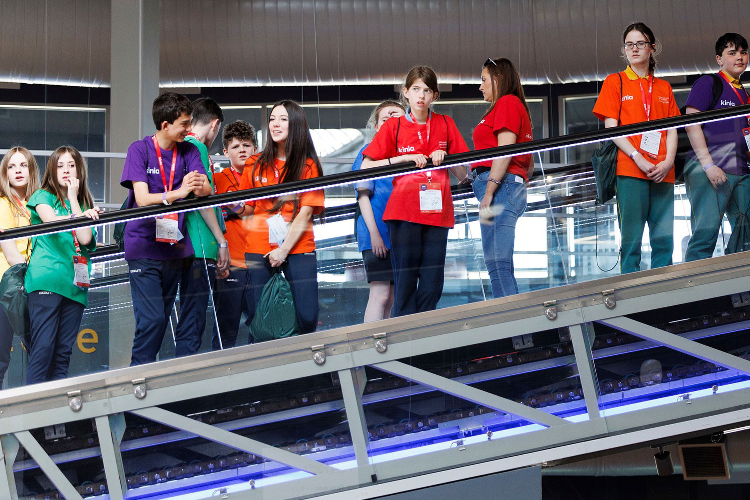
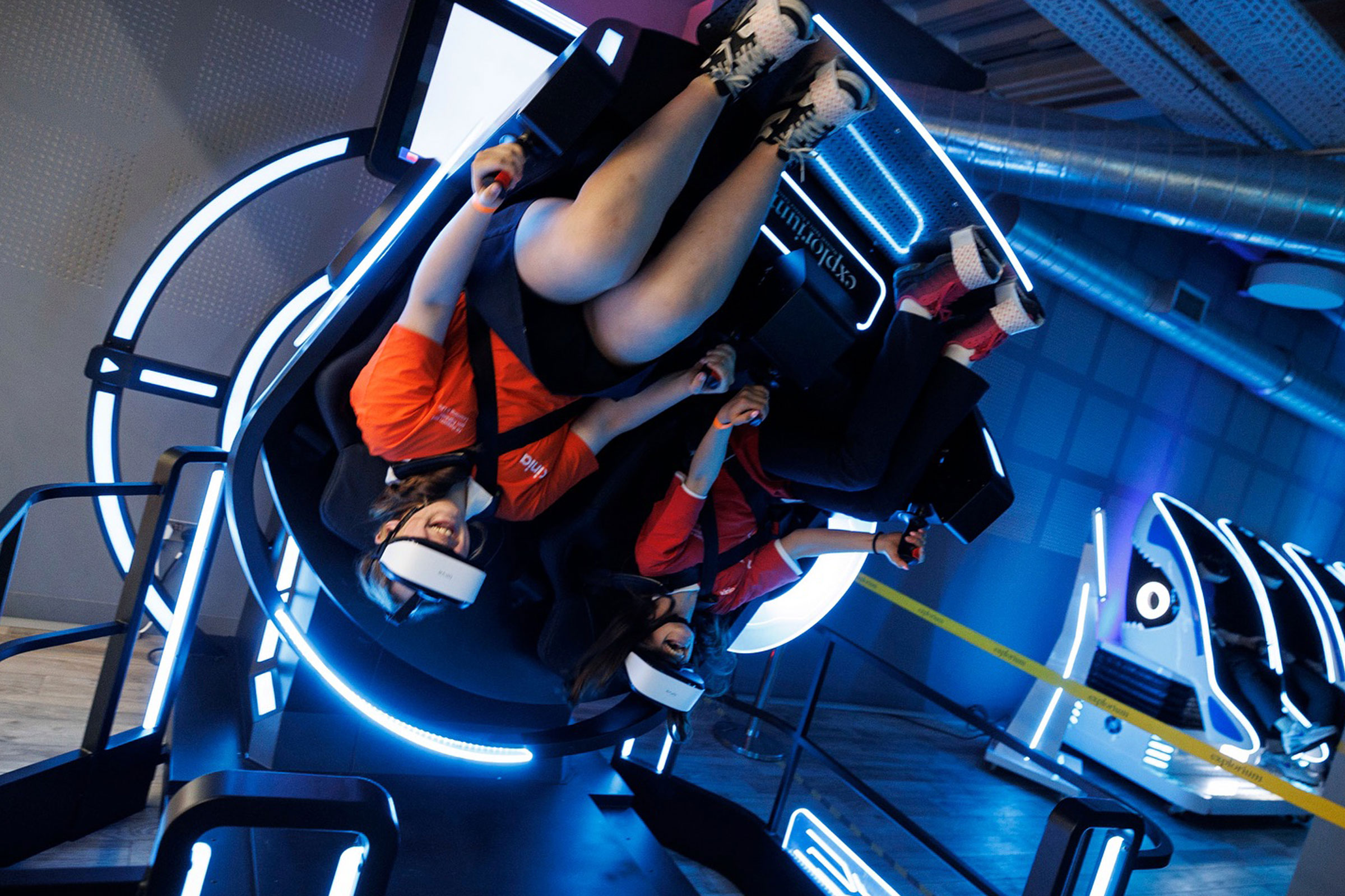
A brand capable of bringing together employees, volunteers, partners and communities around a common mission: creating opportunity through education and empowering young people to achieve their full potential.


We not only have a new name and brand, we have gained valuable insight into our collective mission and vision.
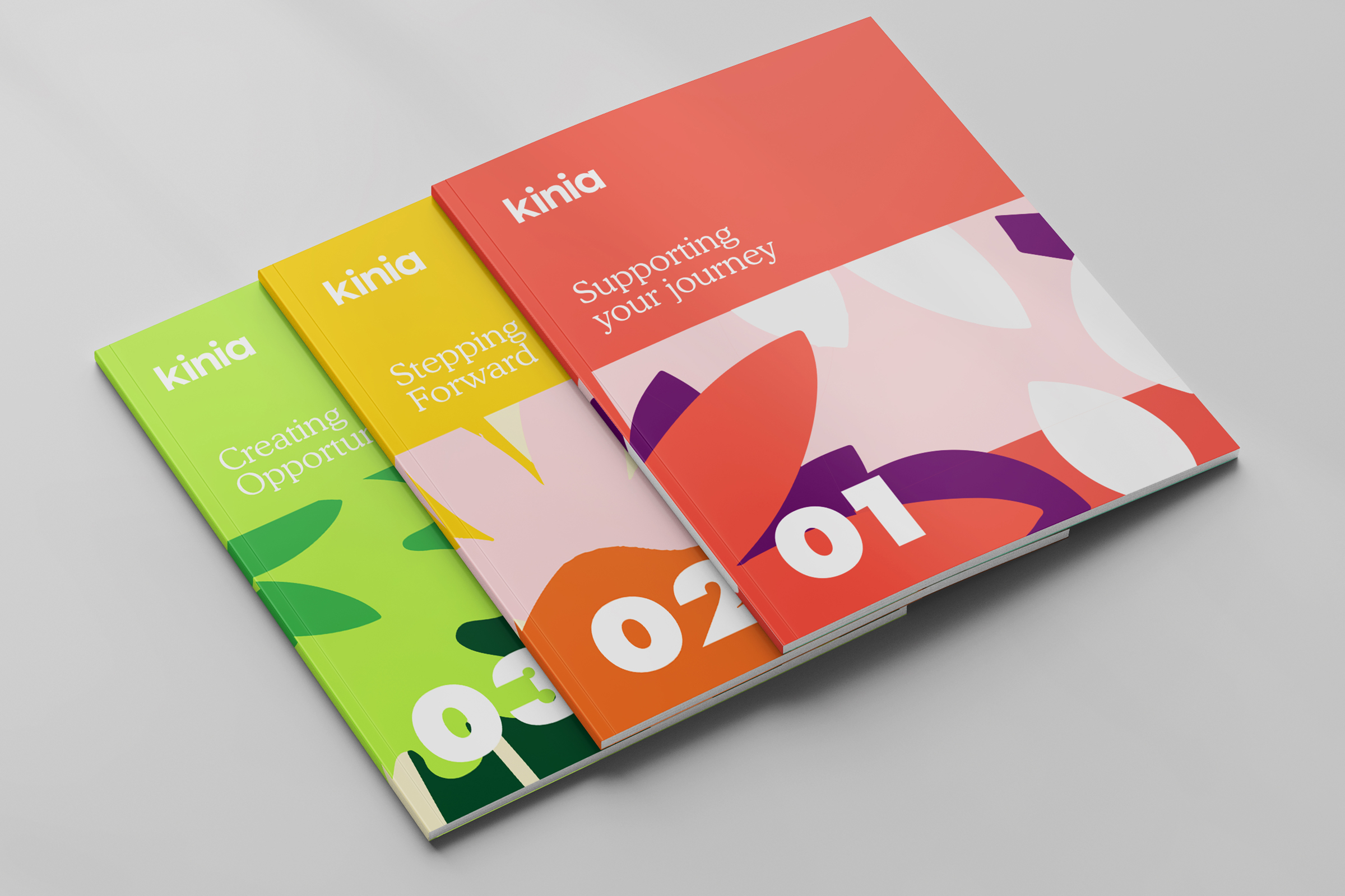
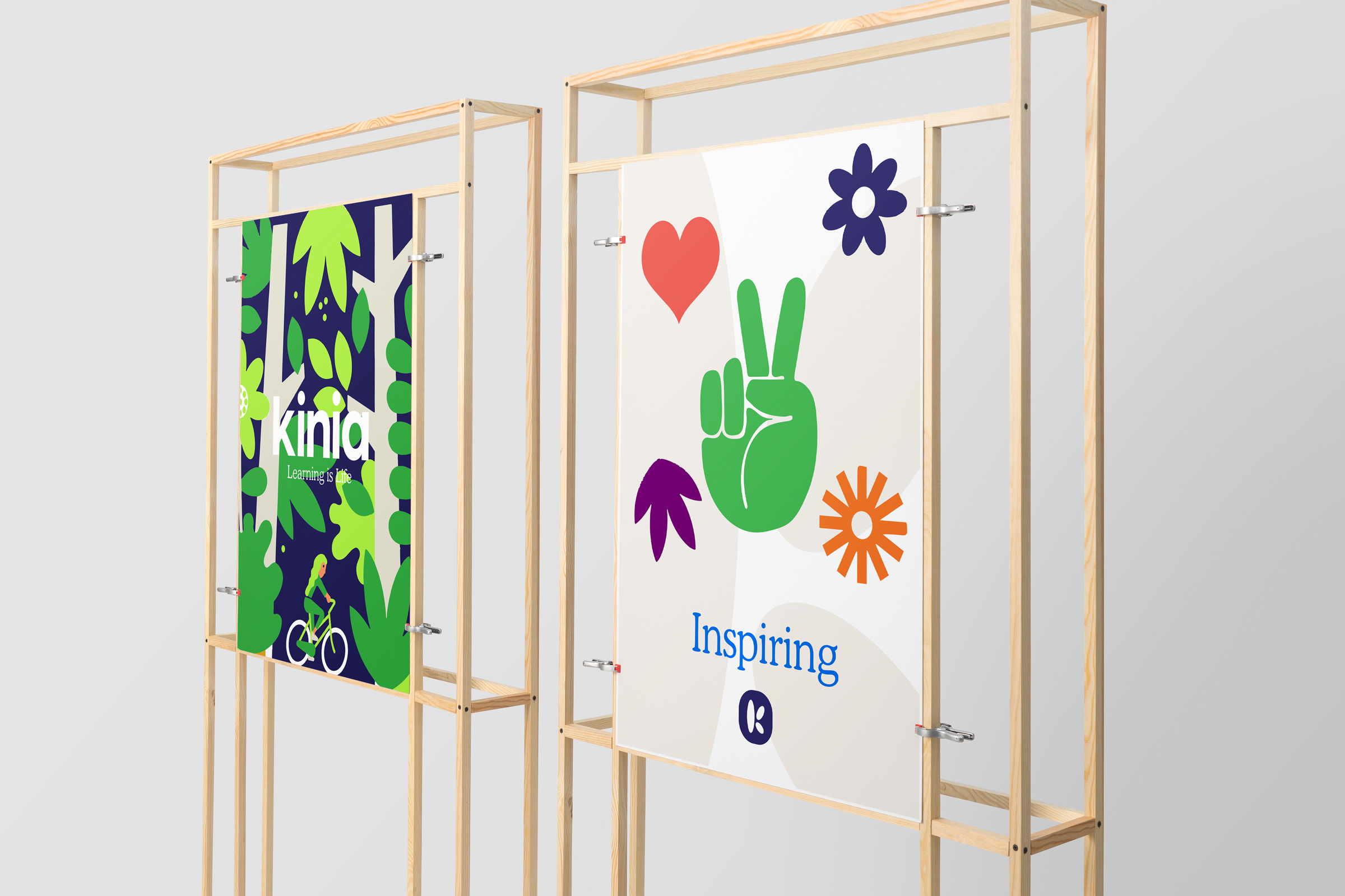
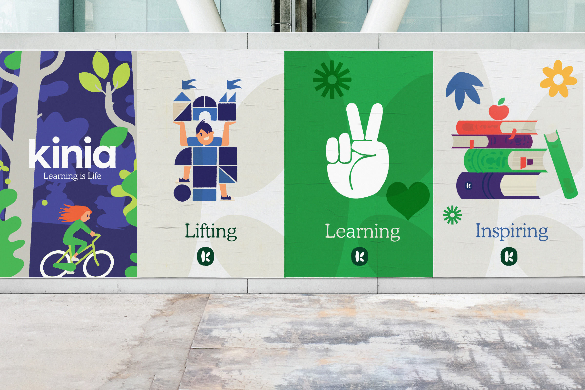
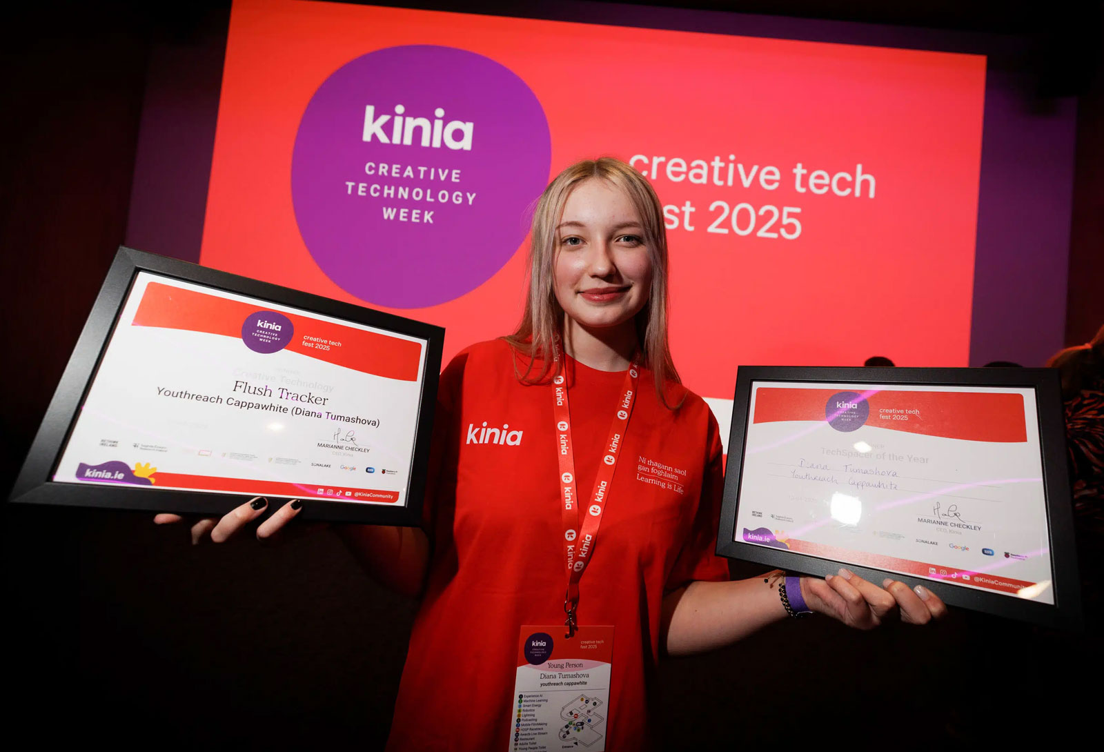
Vibrant and alive
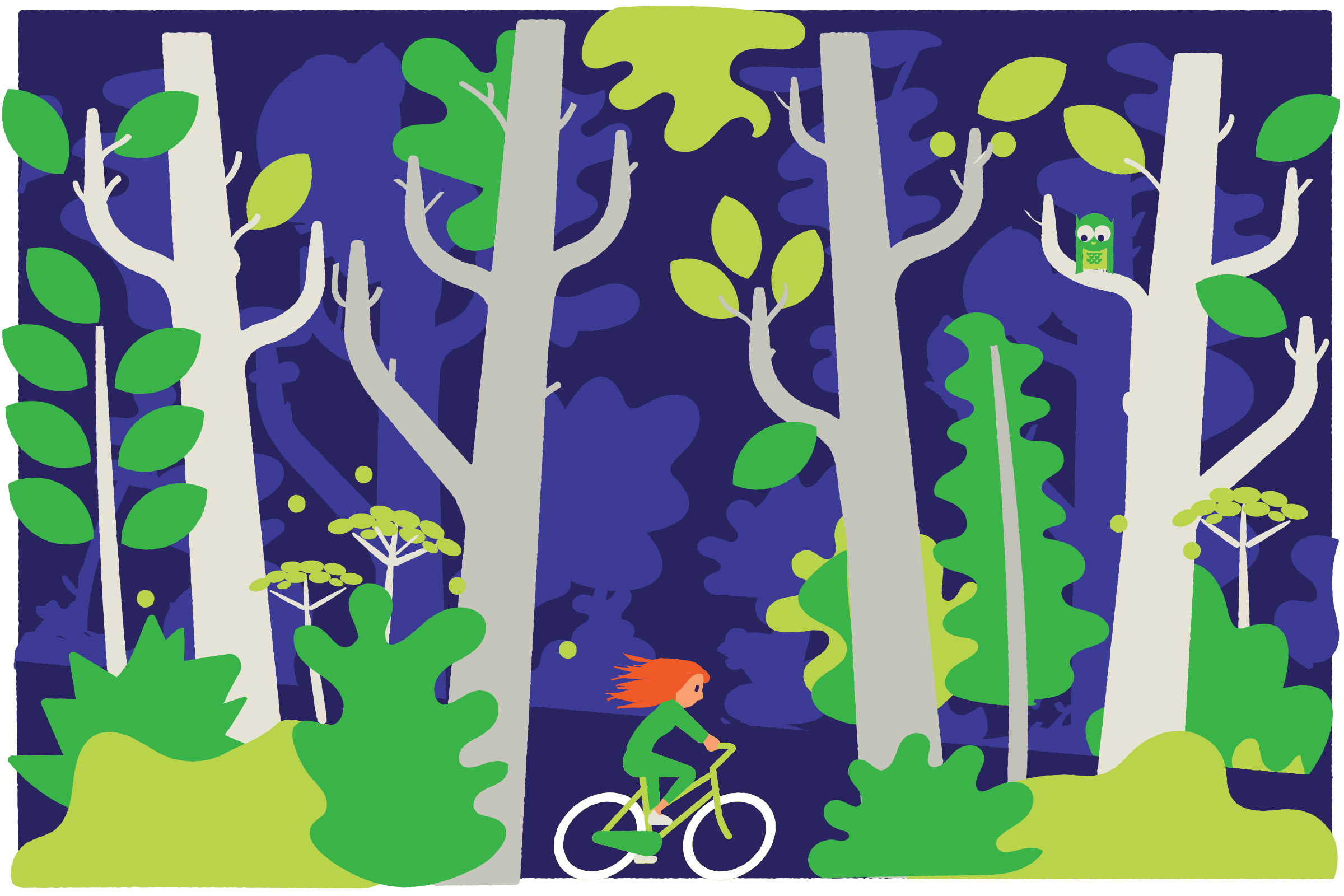
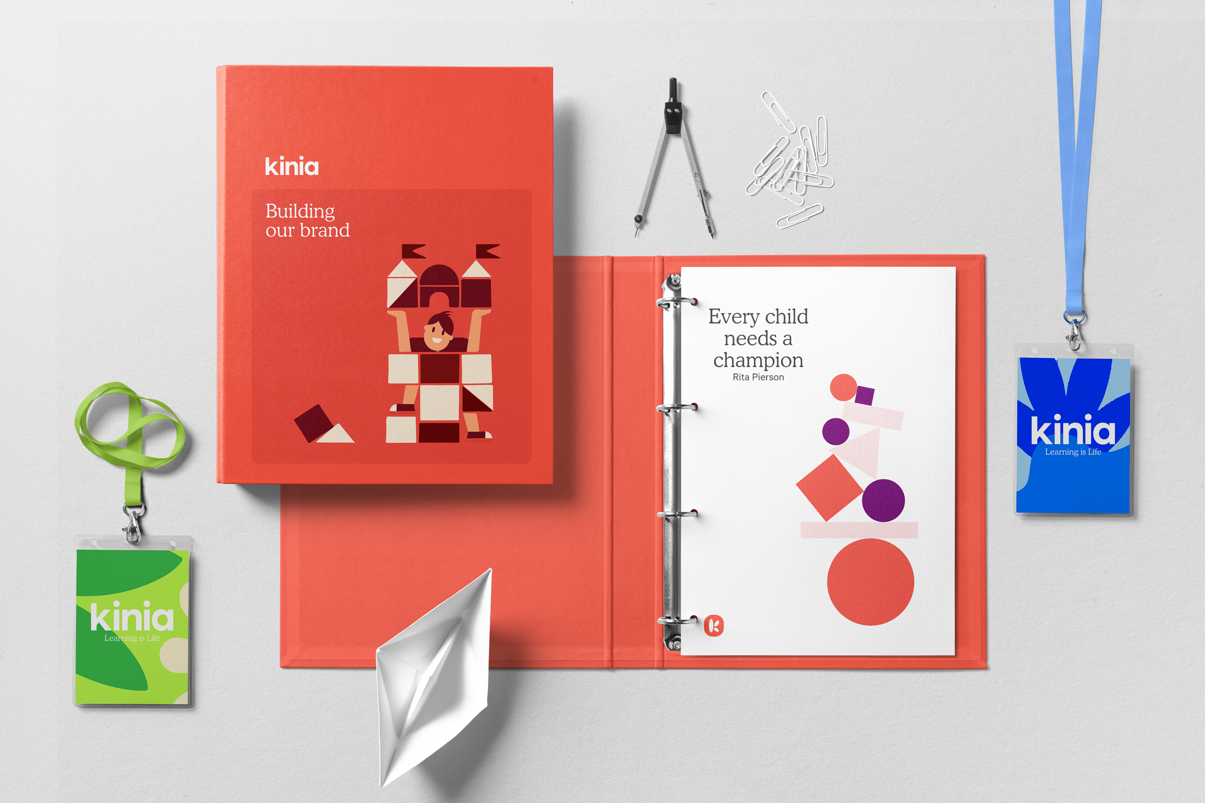
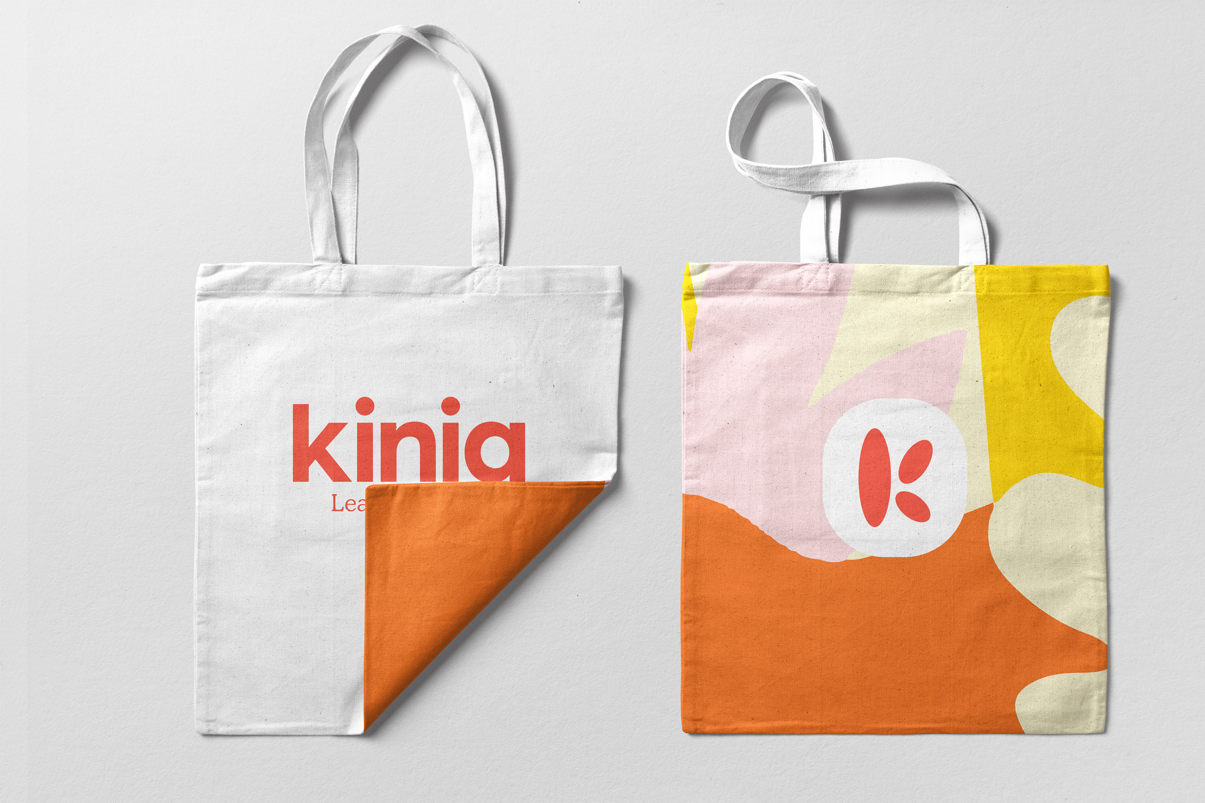
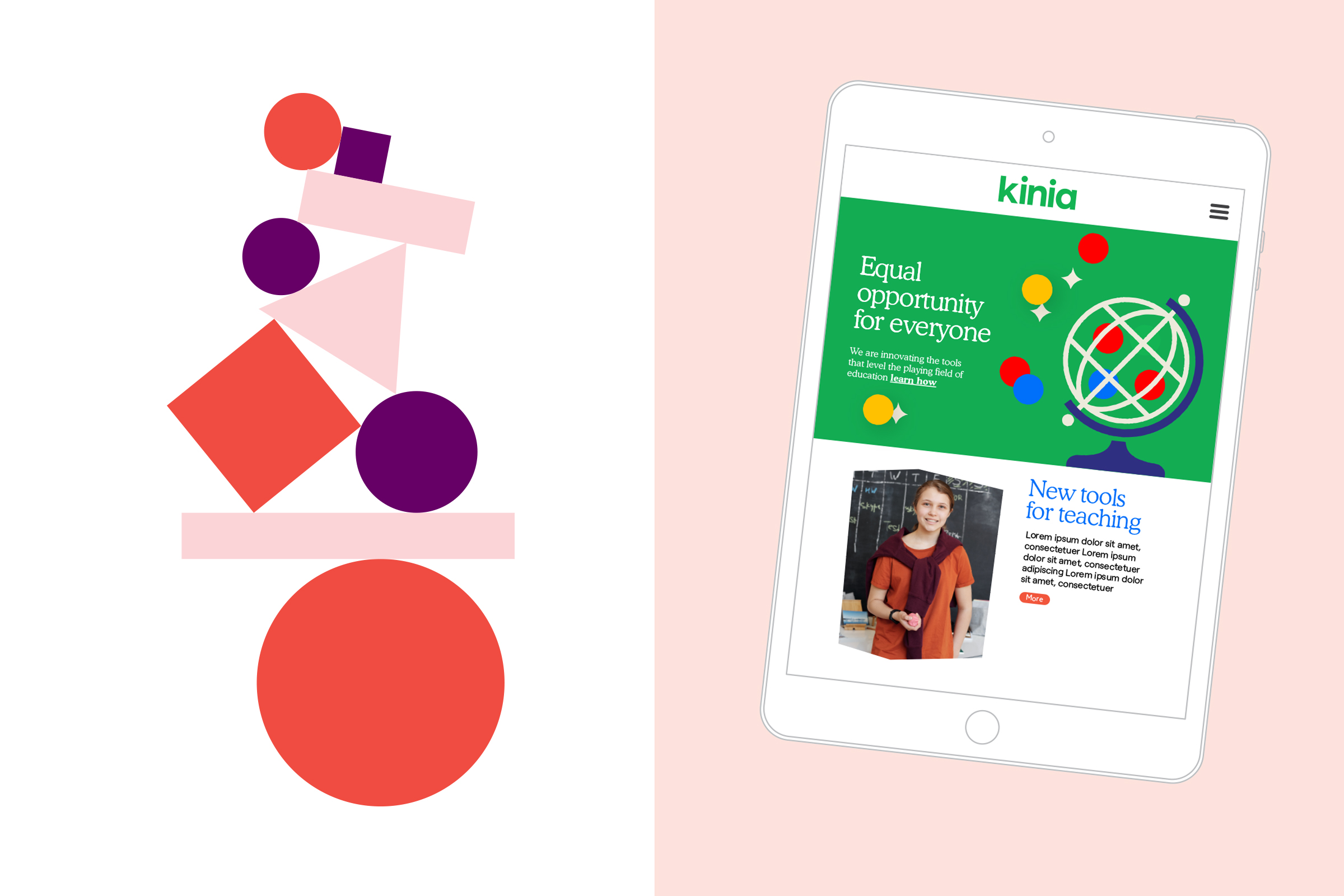
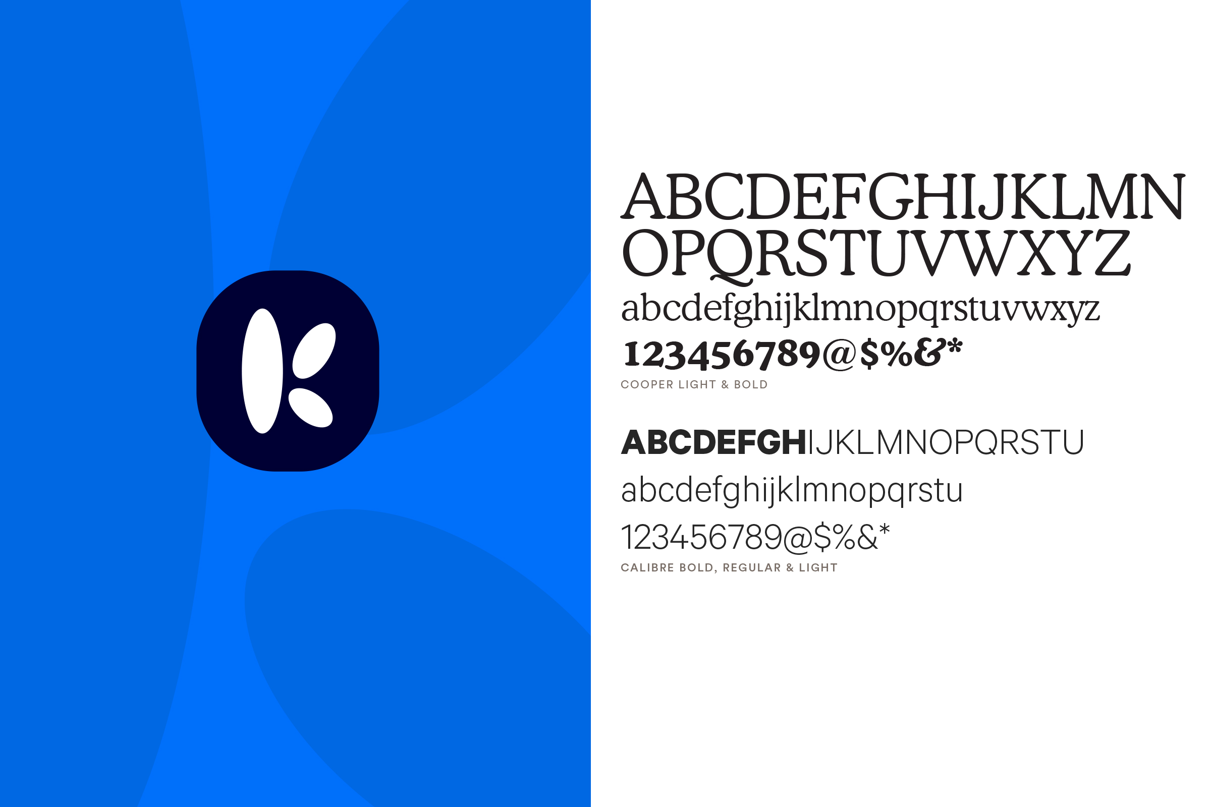
Our inspiration to visually bring all of this positivity to life came from the creativity of the classroom, cutting coloured paper to create shapes and forms that could express ideas with simplicity and strength. Inspired also by Henri Mattise and Keith Haring on bringing energy and light to the visual language, our shapes and forms and our core logo device came from this playful exploration. We created a ‘K’ monogram formed of differing parts coming together. Icons and illustrations were then created, based on different themes and finally patterns and organic shapes that could transcend from paper to pixel, and be created equally by designer or child, a brand that all could embrace.
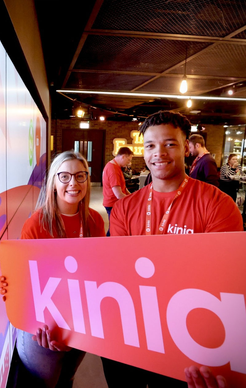
Kinia now has a distinctive name, a compelling brand and a toolkit of assets that enables it to reach out and connect to any audience in any medium. The future's already a little brighter in its hands.
We had a rare challenge for Alkamee.
The rebrand was both an exciting and nervous time for us as an organisation as we were keen to ensure ownership internally and alignment with our external stakeholders. Alkamee guided us with a patient professionalism that supported us to gain confidence in our rebrand journey. They brought a thoughtful objectivity, fresh energy and deep understanding to the development
of our new brand Kinia.


