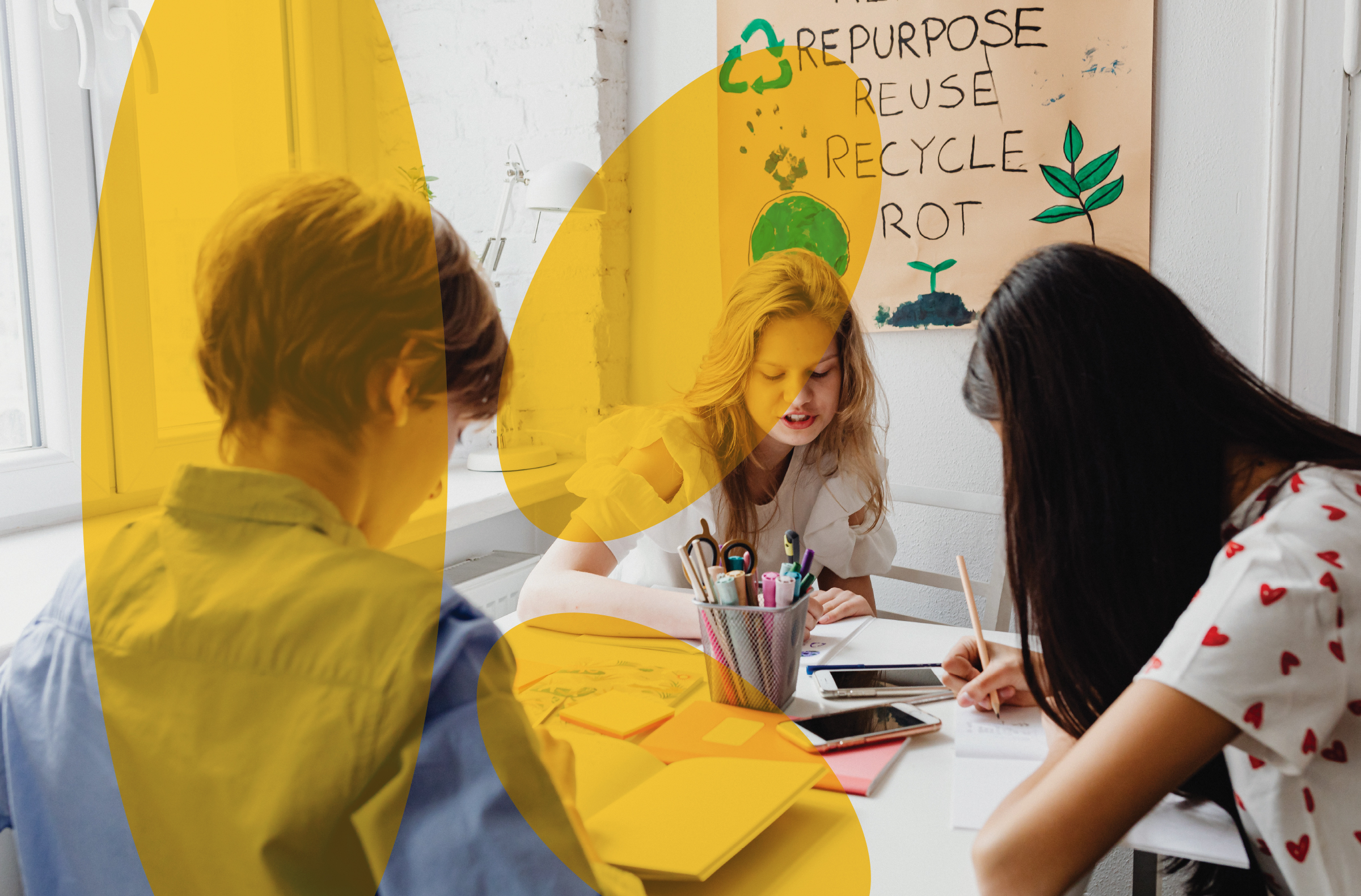
Camara Ireland and Suas Ireland, two established organizations in education approached us to build a brand that wholly represented the strength of their collaboration and one that would propel them forward in a transformative way. By merging, they would be capable of so much more and needed a purposeful and powerful entity united in its vision, all represented by a new name and brand identity.
We created
- Brand Strategy
- Naming
- Brand Identity
- Design & Art Direction
A new name for empowerment
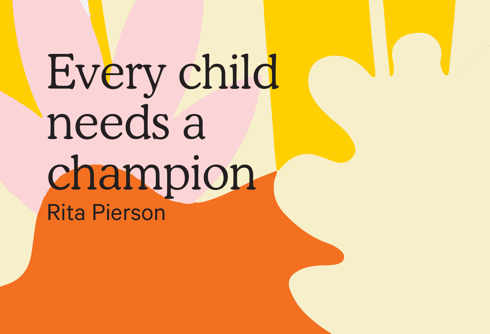
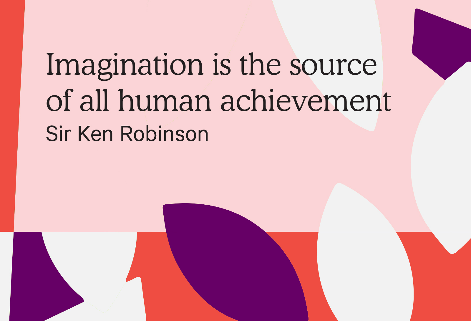
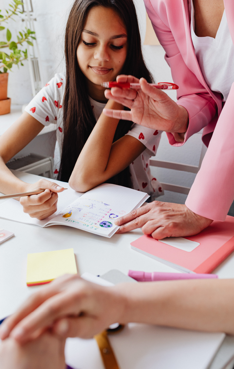
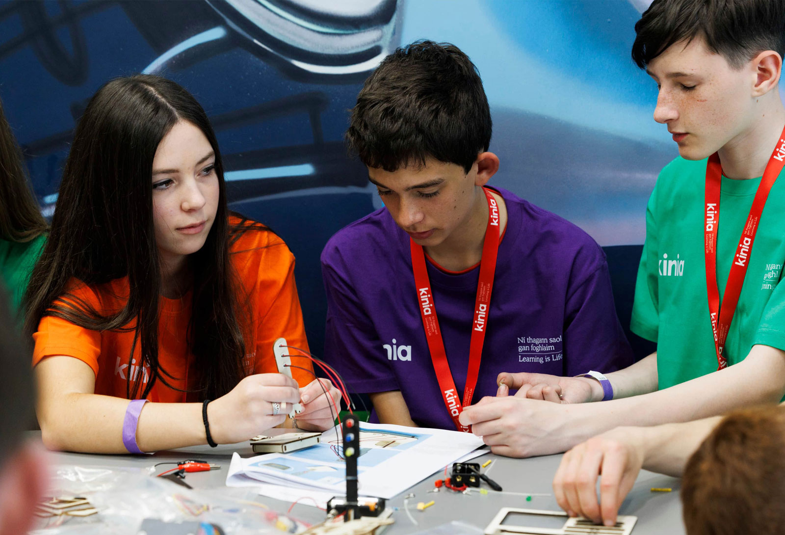
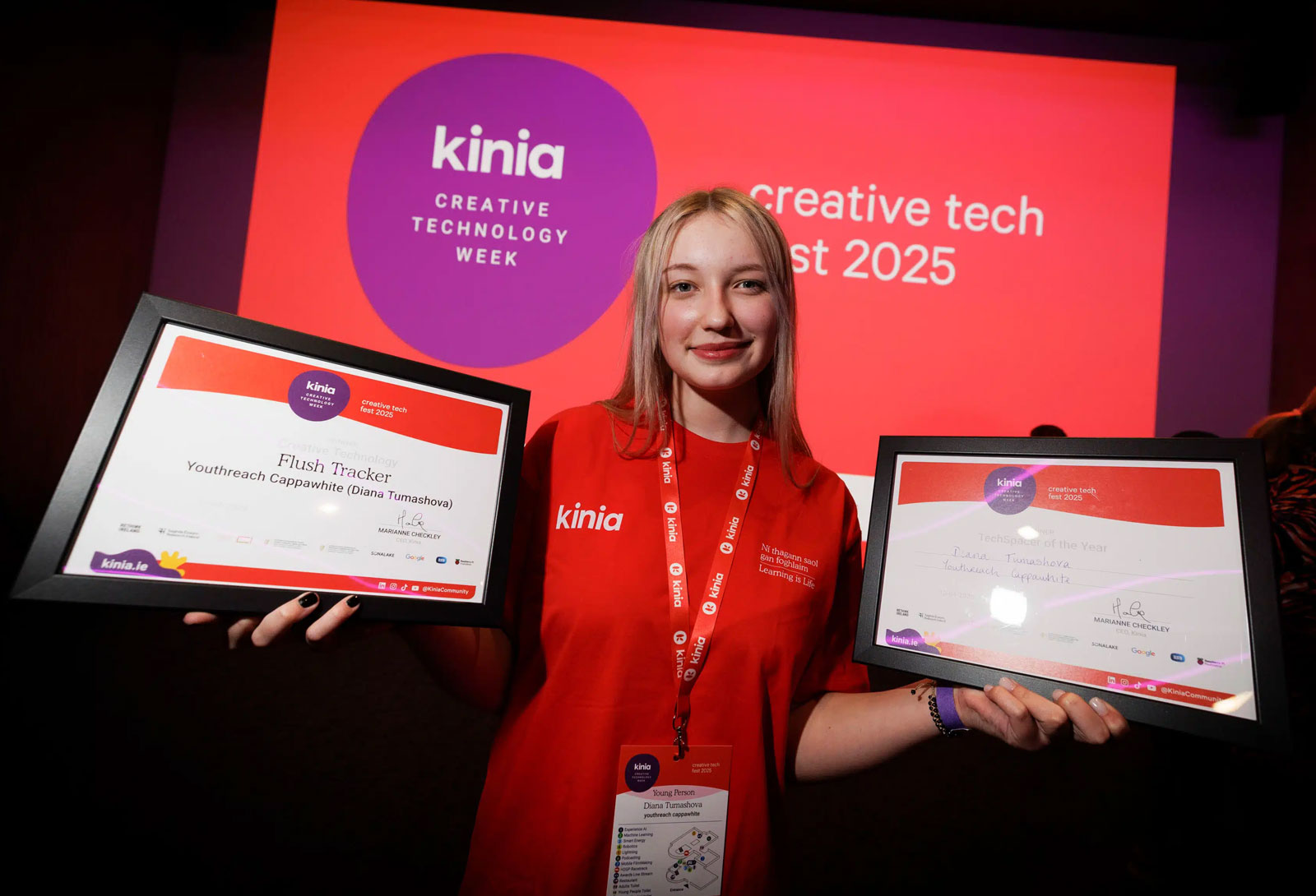
The ultimate goal was to create an engaging, memorable, meaningful name and brand identity for the new organisation. A name that would tell their story and an identity that would communicate a body united in its mission in promoting education and equality for every child. Most importantly of all, the new brand needed to excite and inspire young people to reach higher to really achieve their true potential.

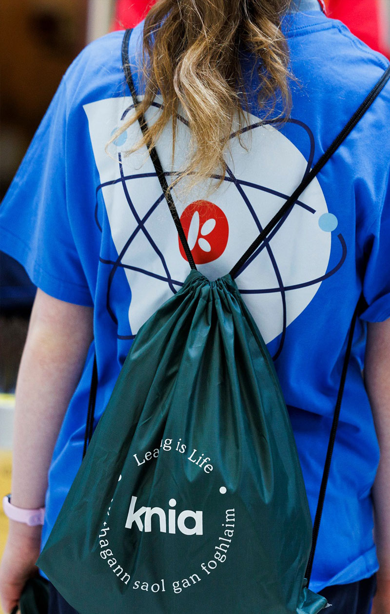
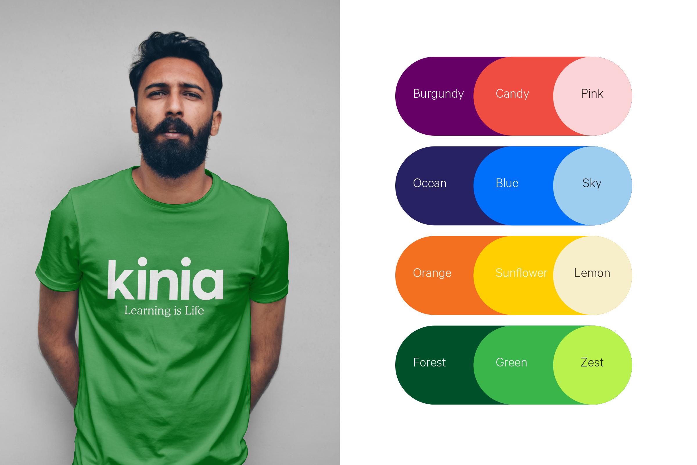
Learning is Life
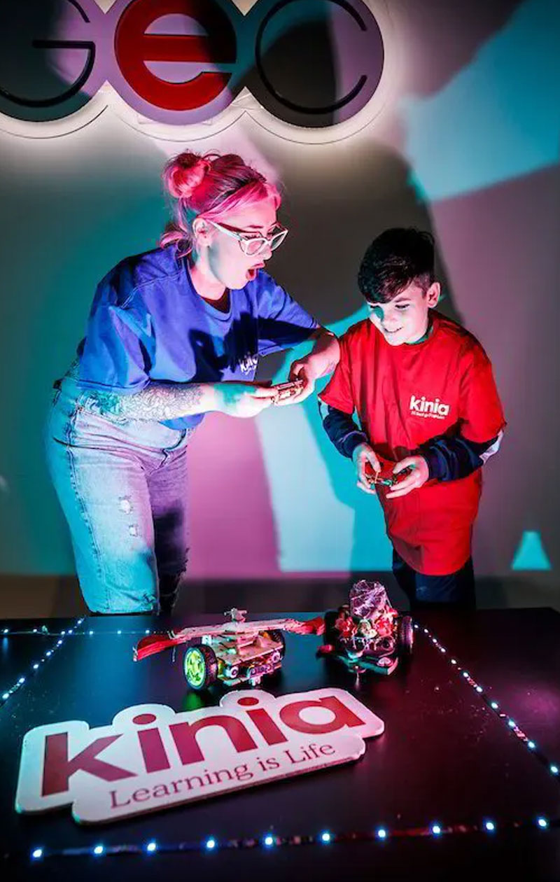
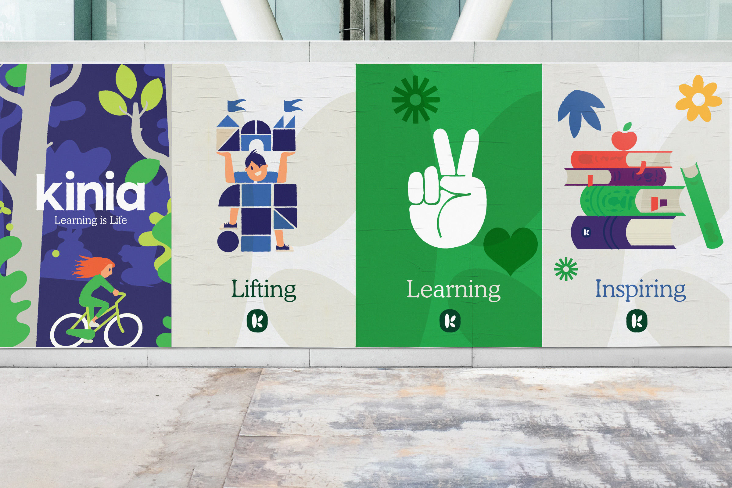
Learning builds a spirit of lifelong curiosity and imbues individuals with personal confidence. Both organisations were all about helping children reach higher and achieve their true potential. So we defined a solid positioning of 'Collectively creating opportunities for children, young people and their communities' with an outward-facing brand purpose for the whole world to see – 'Learning is Life'.
The new name Kinia stems from this positioning - one family coming together to collectively create opportunity, an organisation built around people. It's friendly, warm and communicates a collective coming together for joined action.

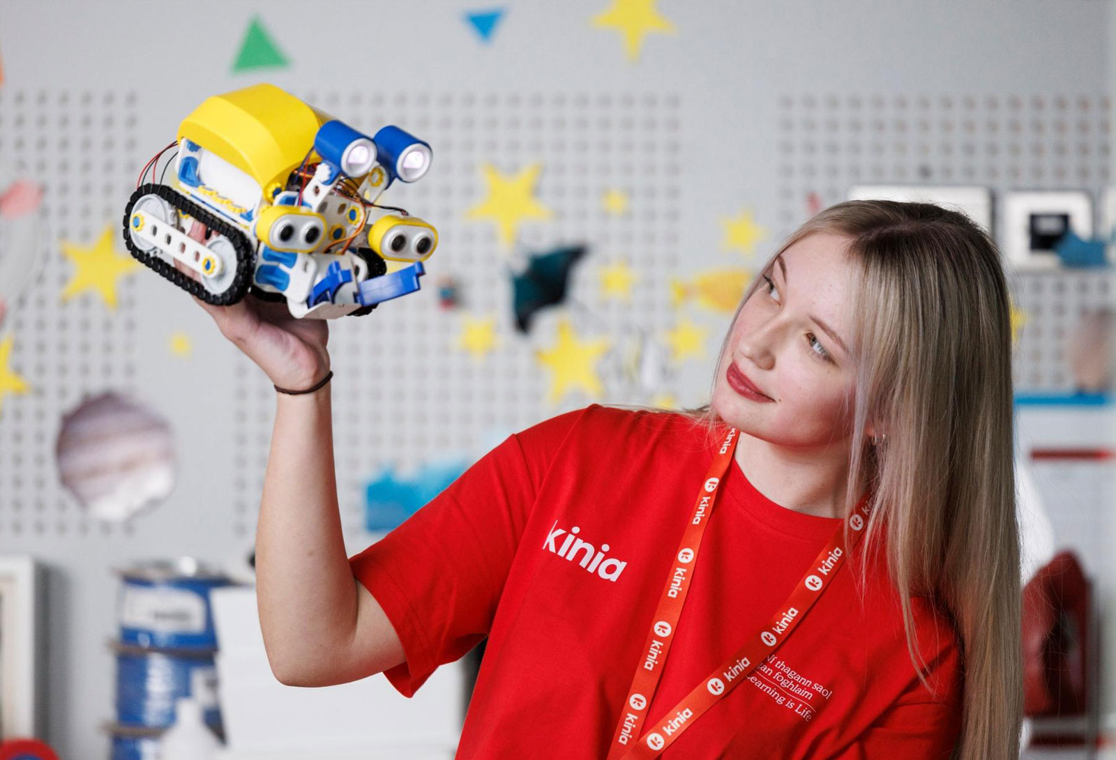
Kinia builds human connections. It's friendliness, resourcefulness, attitude and genuine desire to improve lives is part of their DNA and shapes its every action.
These human and action-orientated qualities are key elements we needed to evoke through the visual identity. We needed to balance the audiences' needs, but ultimately, we wanted to communicate its incredible life-changing mission by creating a flexible, energised and exciting visual language.

We not only have a new name and brand, we have gained valuable insight into our collective mission and vision.
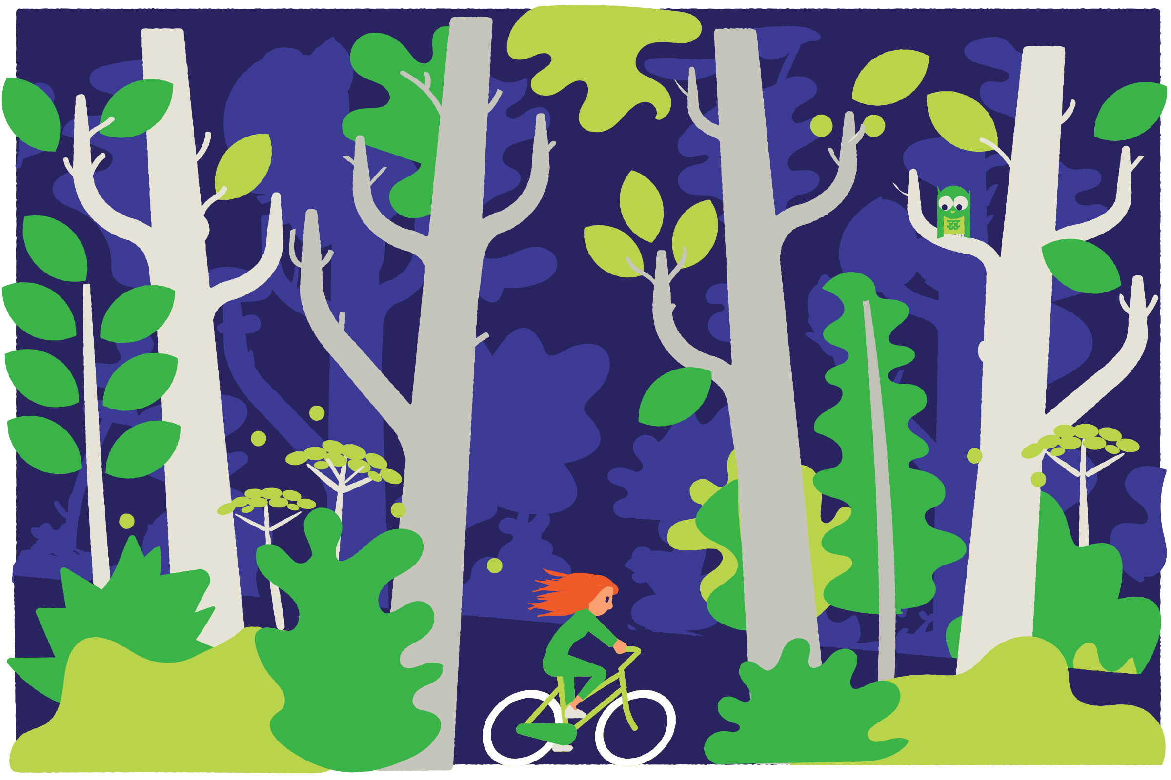
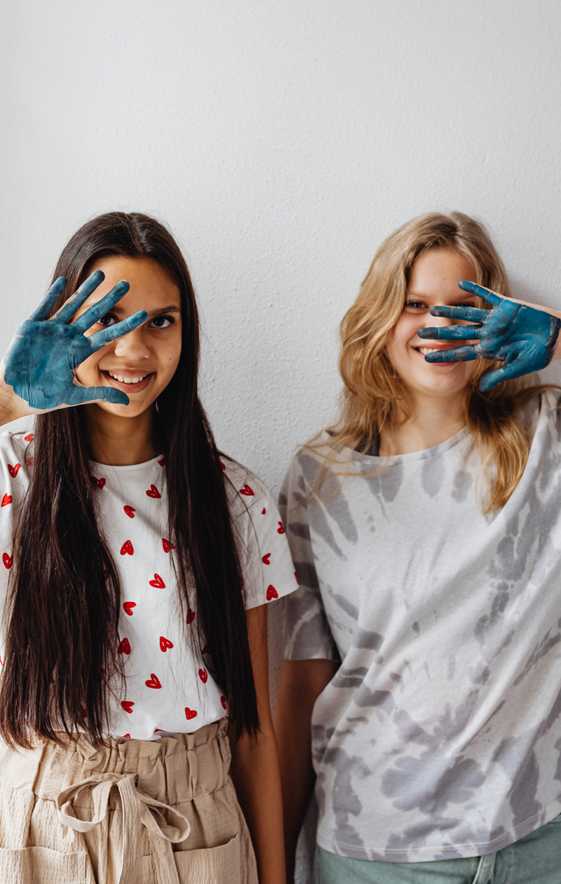
Vibrant and alive
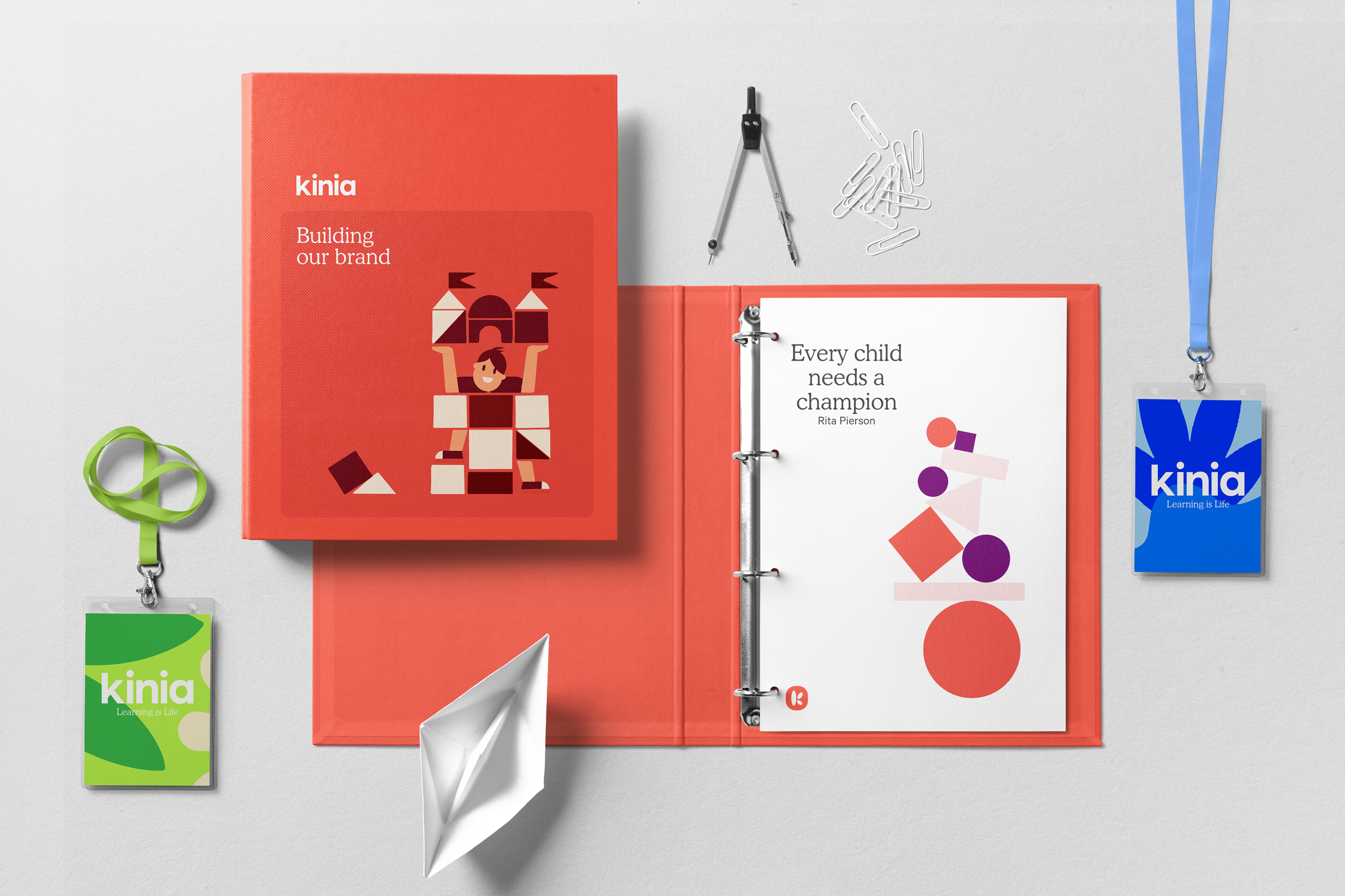
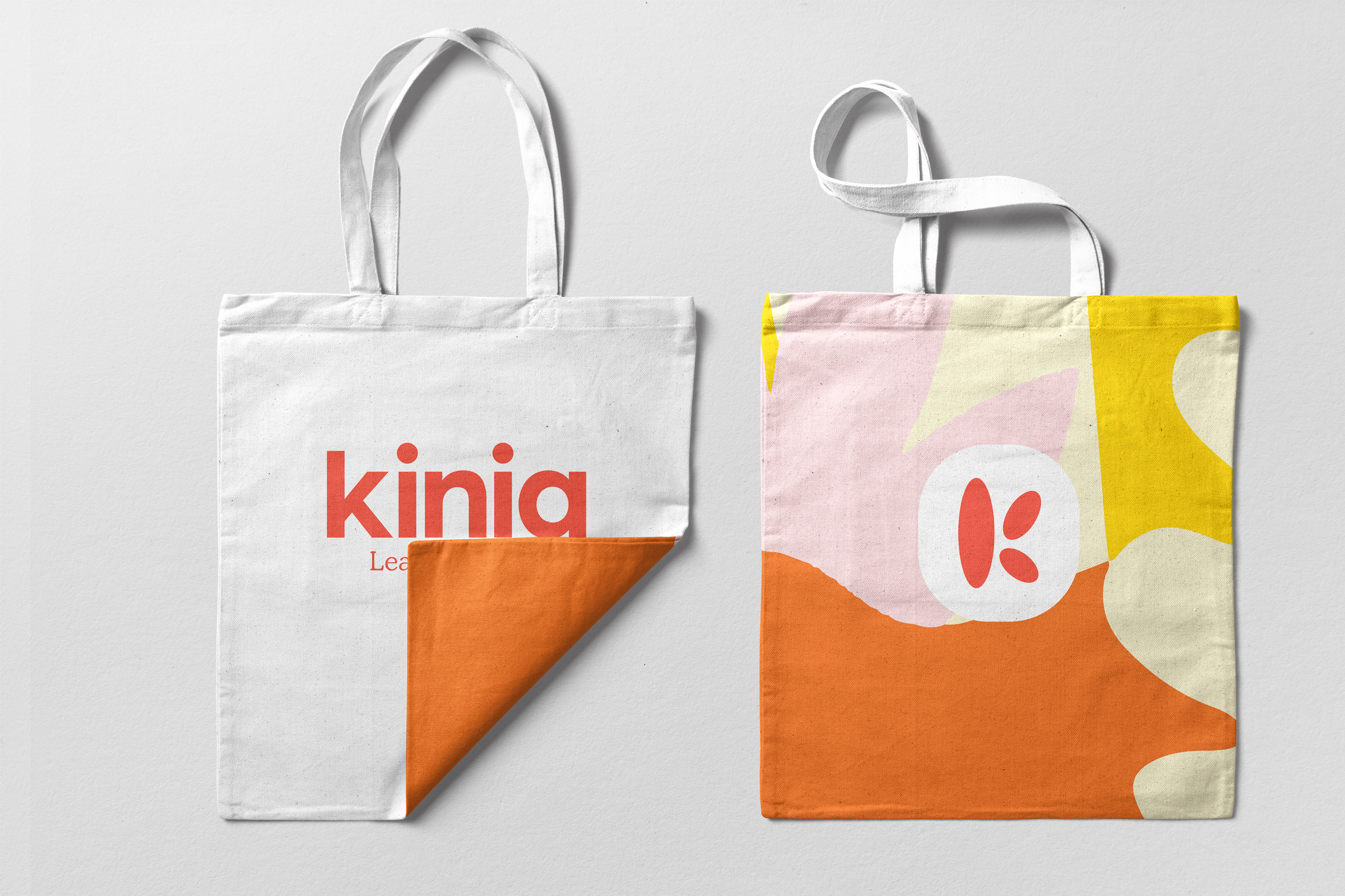
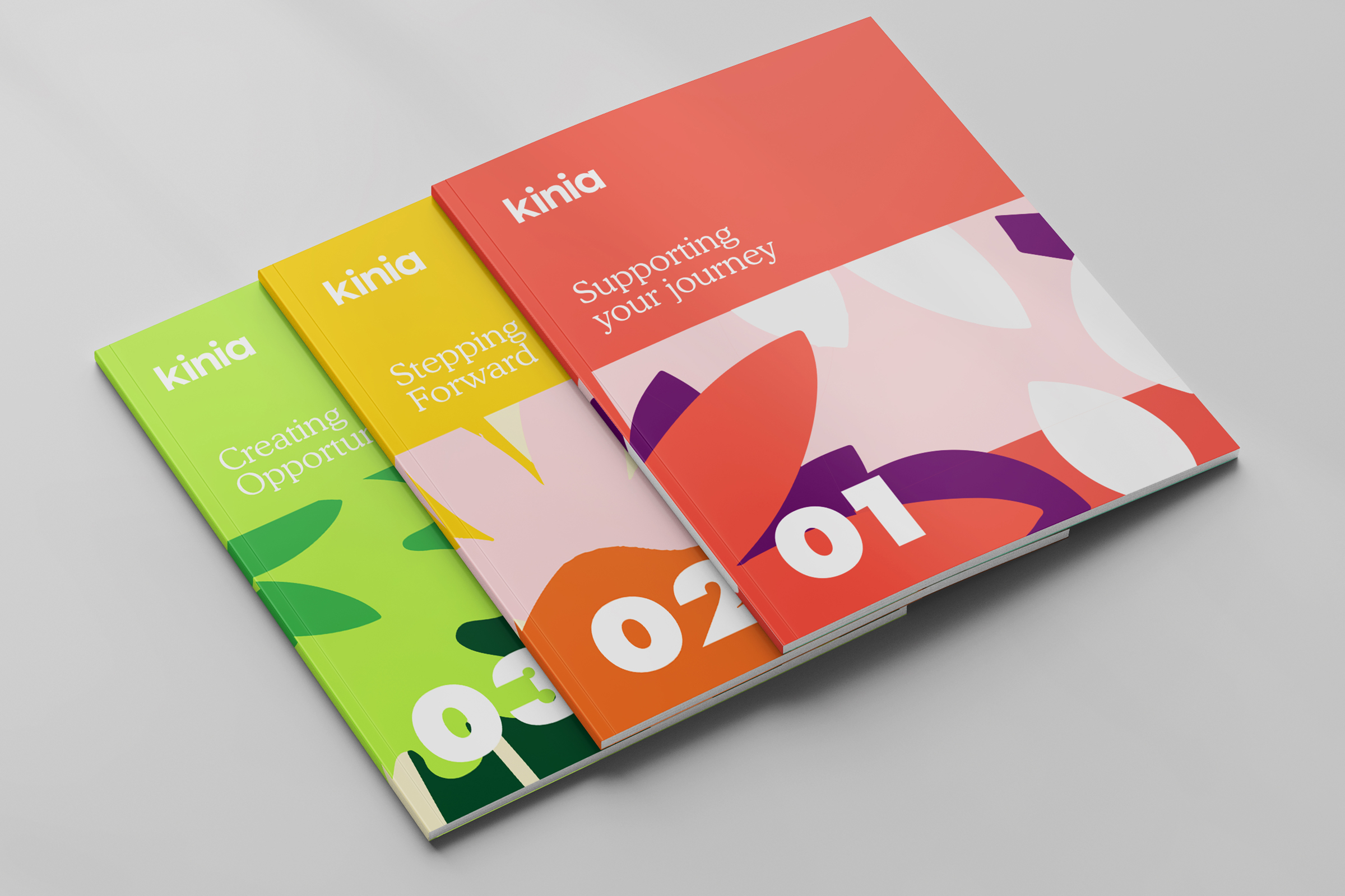
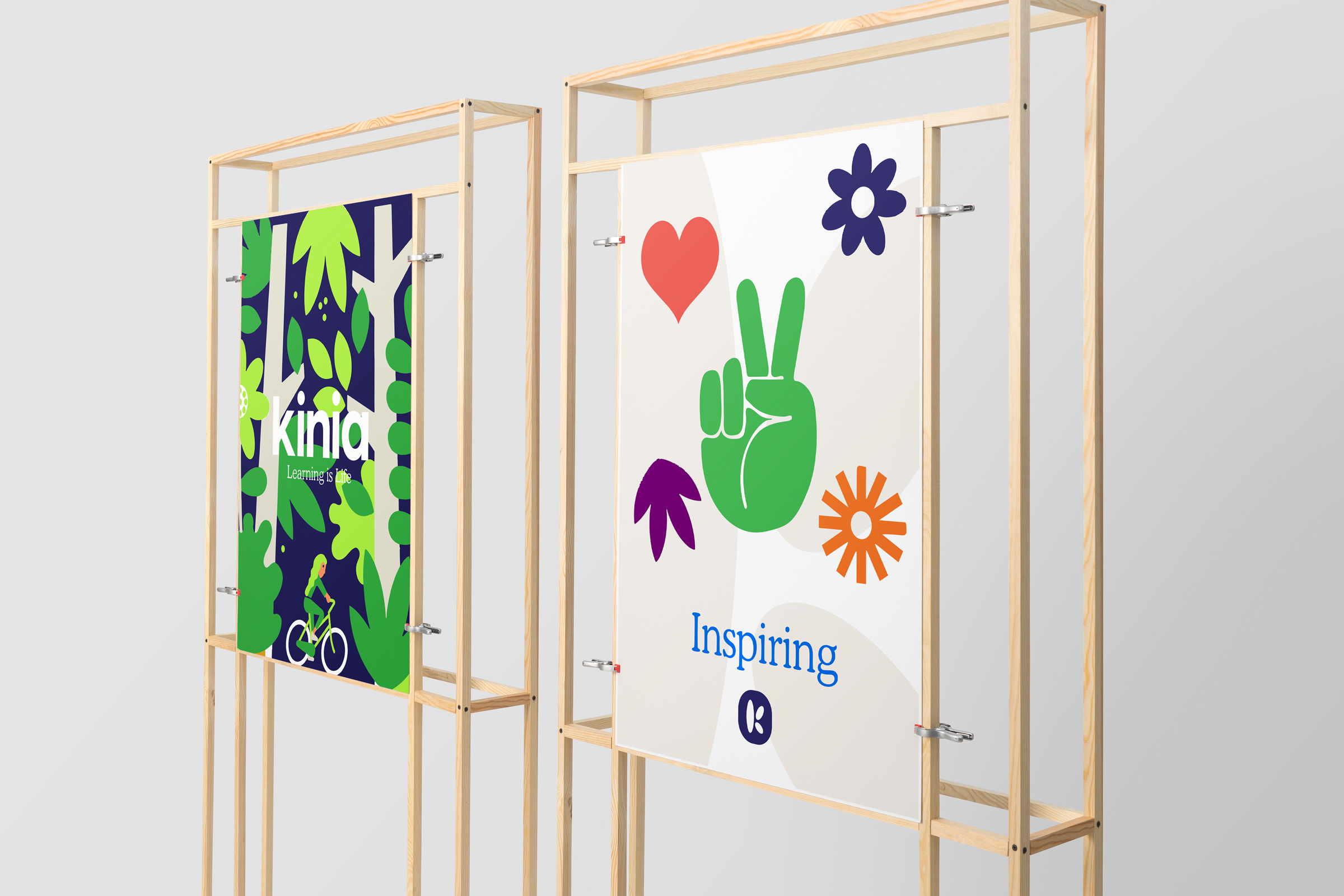
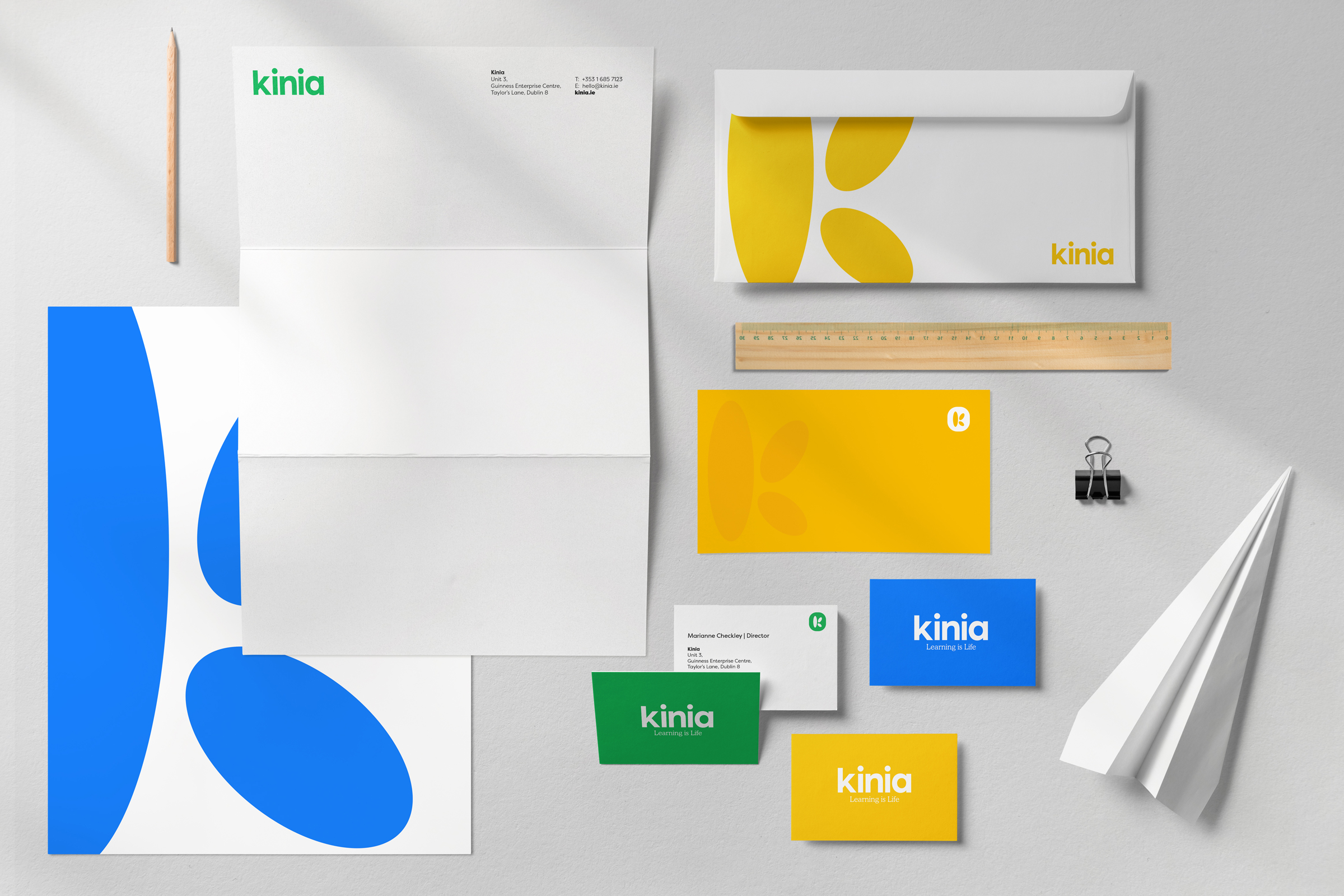
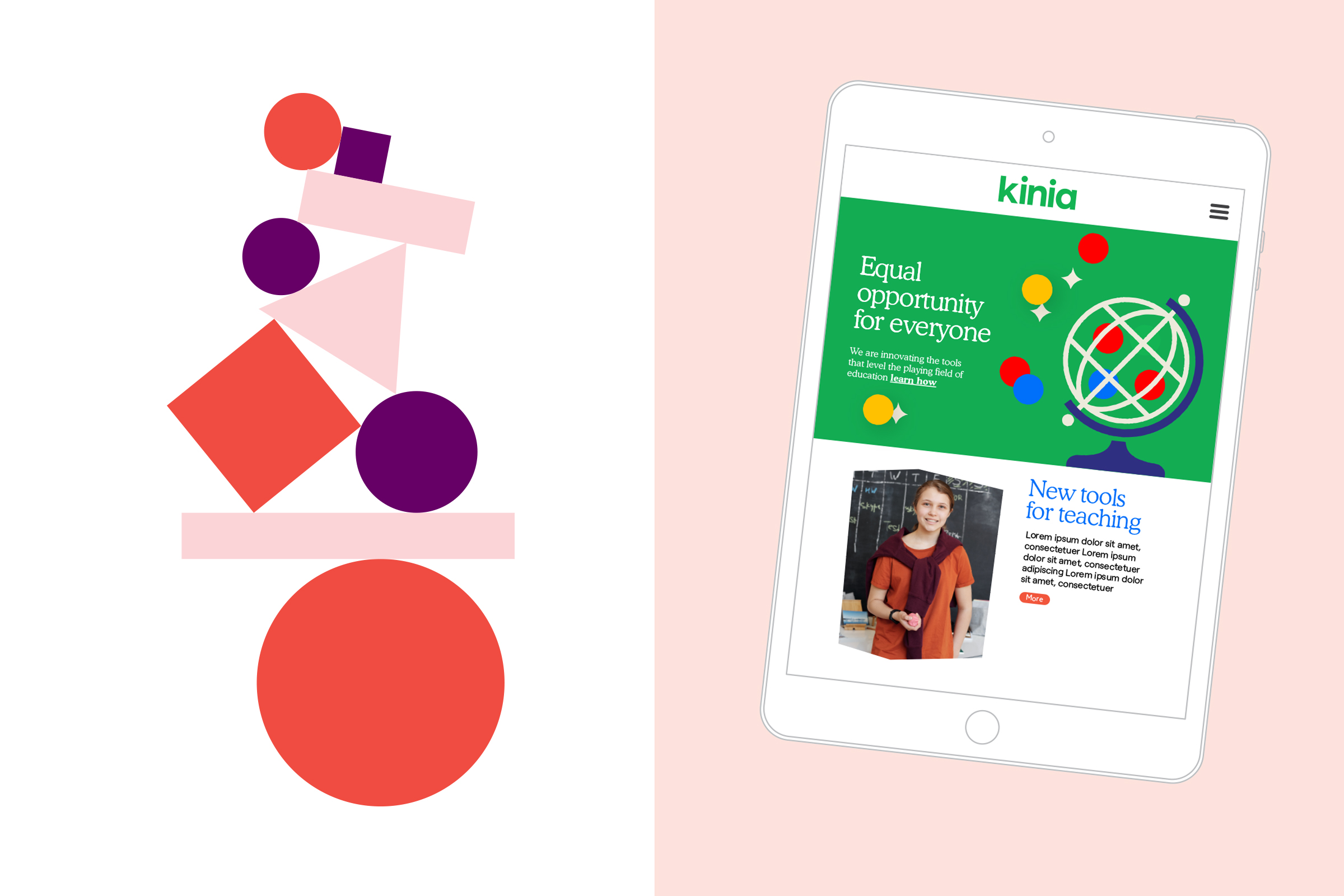
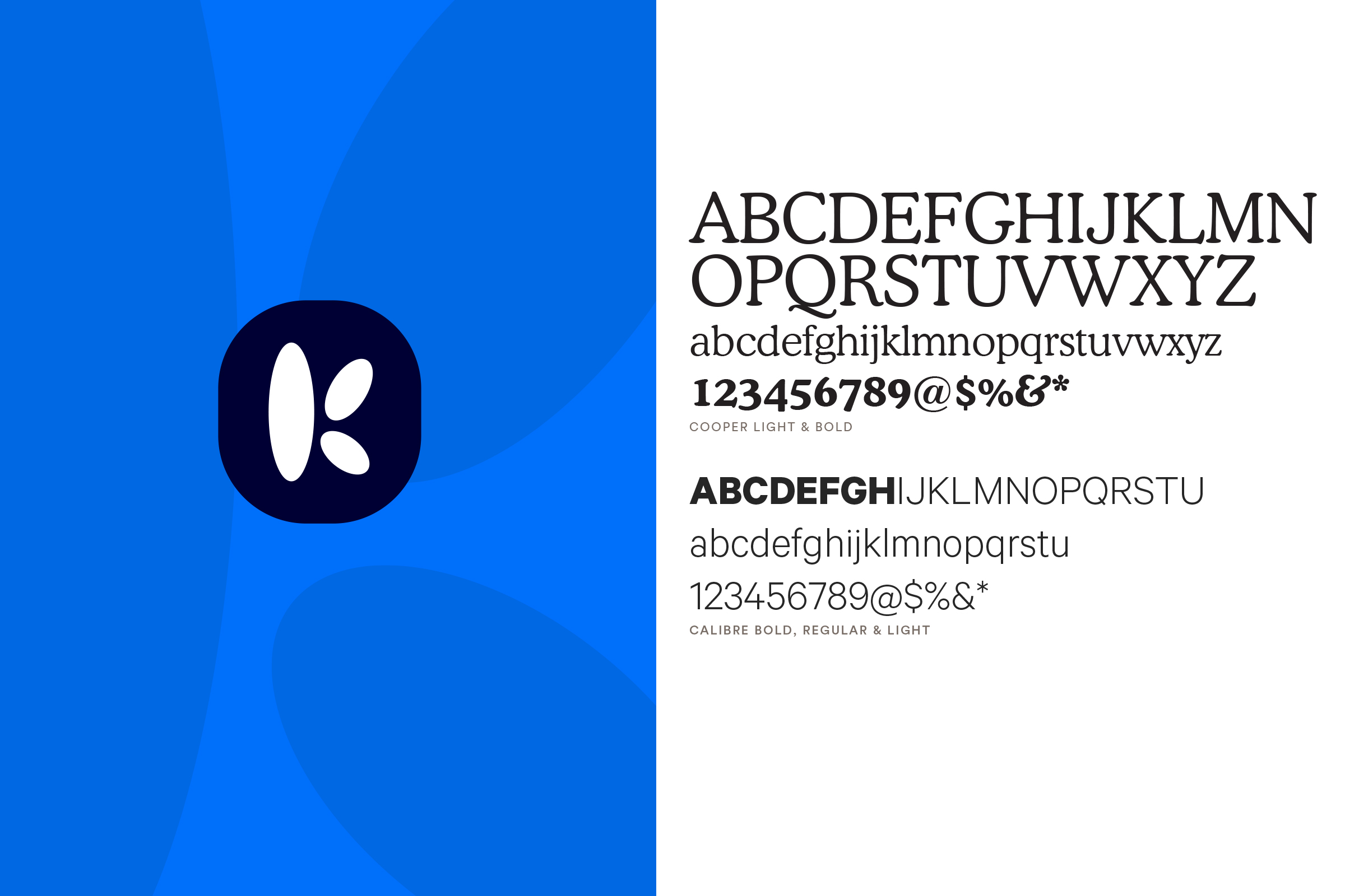
Our inspiration to visually bring all of this positivity to life came from the creativity of the classroom, cutting coloured paper to create shapes and forms that could express ideas with simplicity and strength. Inspired also by Henri Mattise and Keith Haring on bringing energy and light to the visual language, our shapes and forms and our core logo device came from this playful exploration. We created a ‘K’ monogram formed of differing parts coming together. Icons and illustrations were then created, based on different themes and finally patterns and organic shapes that could transcend from paper to pixel, and be created equally by designer or child, a brand that all could embrace.
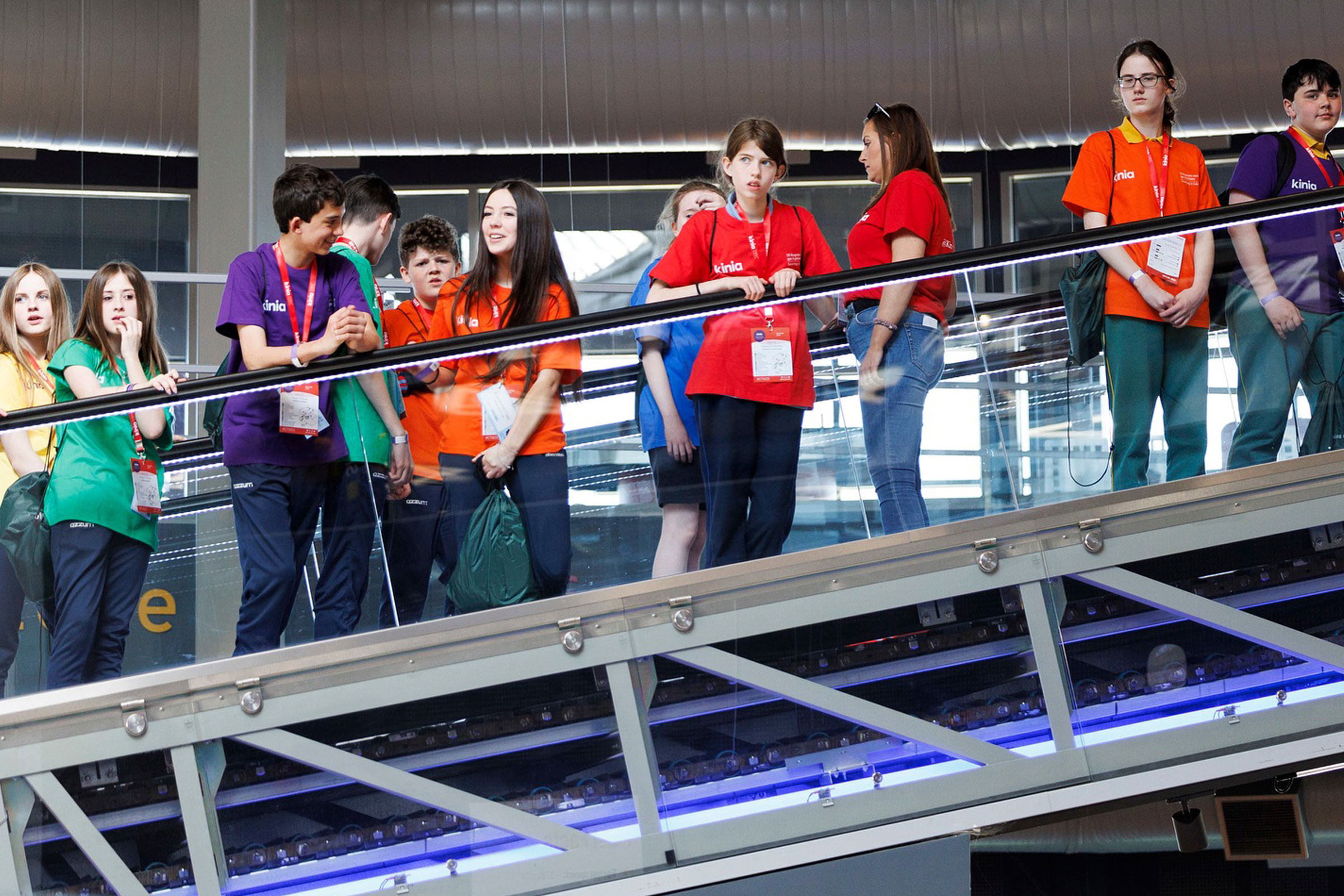
Kinia now has a distinctive name, a compelling brand and a toolkit of assets that enables it to reach out and connect to any audience in any medium. The future's already a little brighter in its hands.
We had a rare challenge for Alkamee.
The rebrand was both an exciting and nervous time for us as an organisation as we were keen to ensure ownership internally and alignment with our external stakeholders. Alkamee guided us with a patient professionalism that supported us to gain confidence in our rebrand journey. They brought a thoughtful objectivity, fresh energy and deep understanding to the development
of our new brand Kinia.


