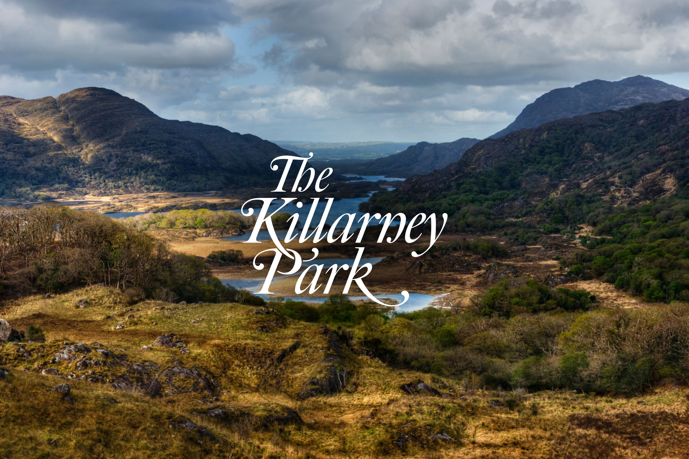
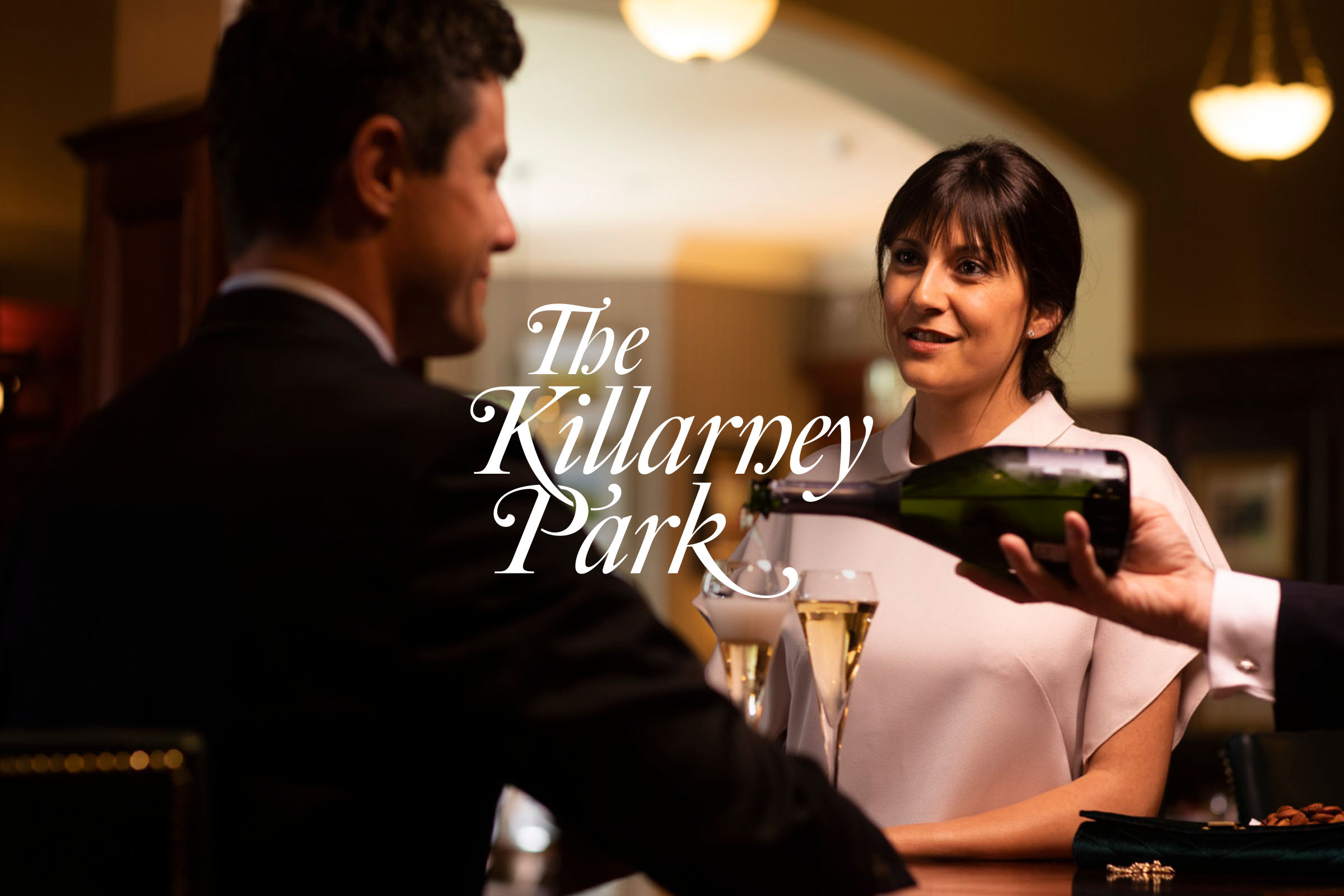
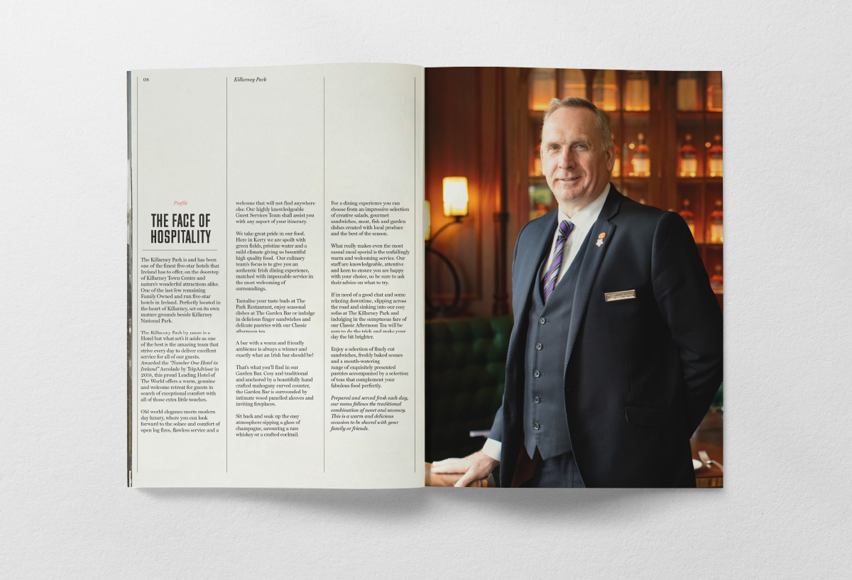
The Killarney Park, a luxury five star hotel and its sister hotel The Ross, a modern four star, are located in the heart of Killarney. Family owned and run with a personable high standard service, the business needed a brand that defined a clear path forward, better reflected their true nature and focus on being a people centric offering with a unique Killarney style.
We created
- Identity
- Brand Strategy
- Naming
- Design & Art Direction
- Digital & Print Communication
- Editorial Communication
- Employee Engagement
The Opportunity
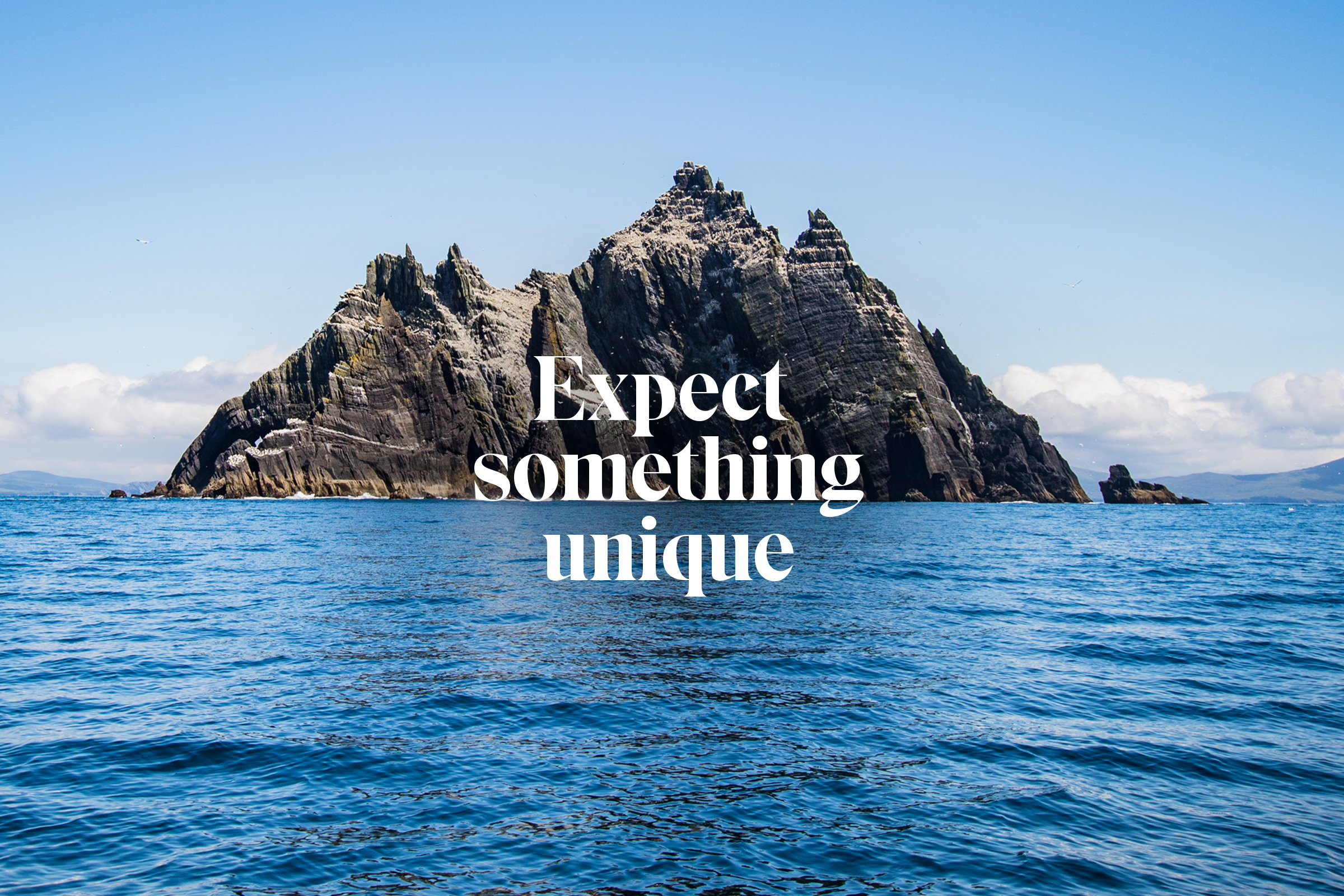
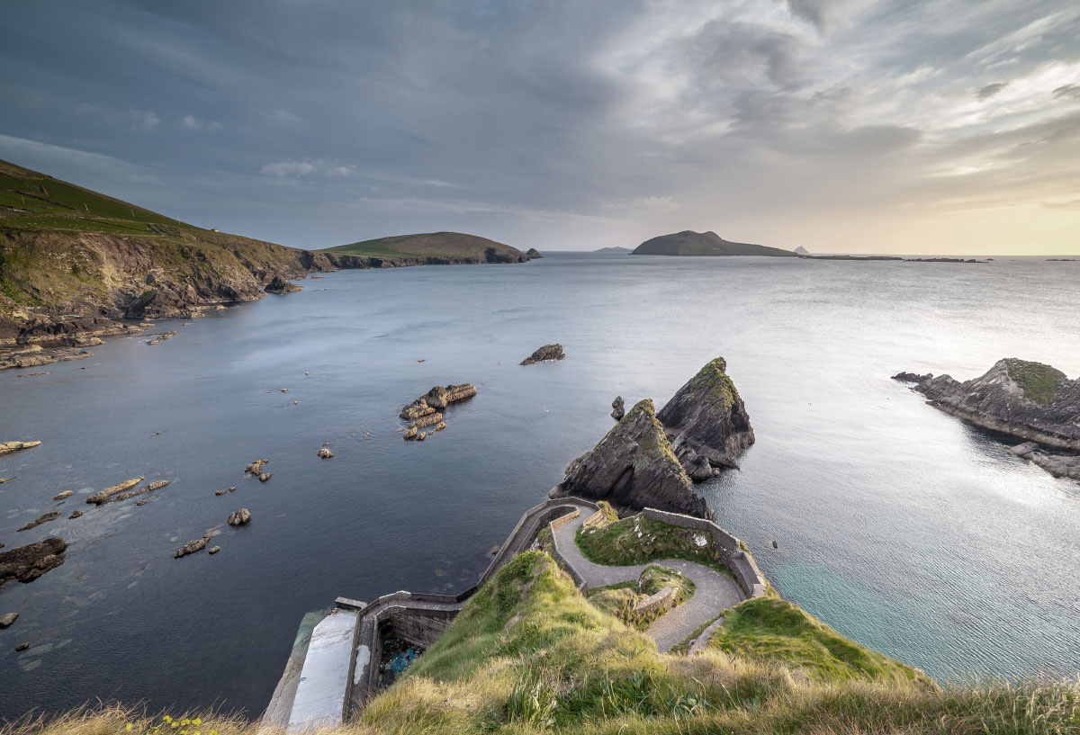
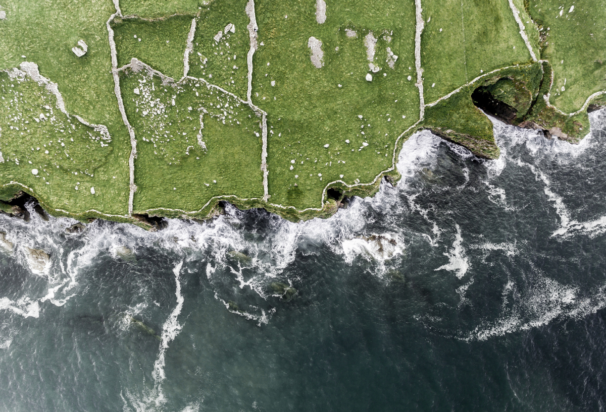
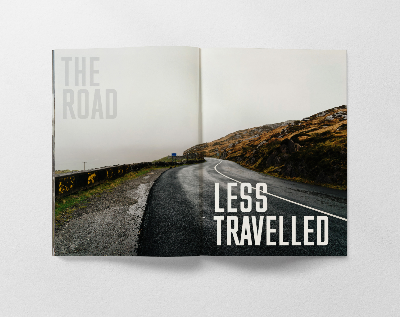
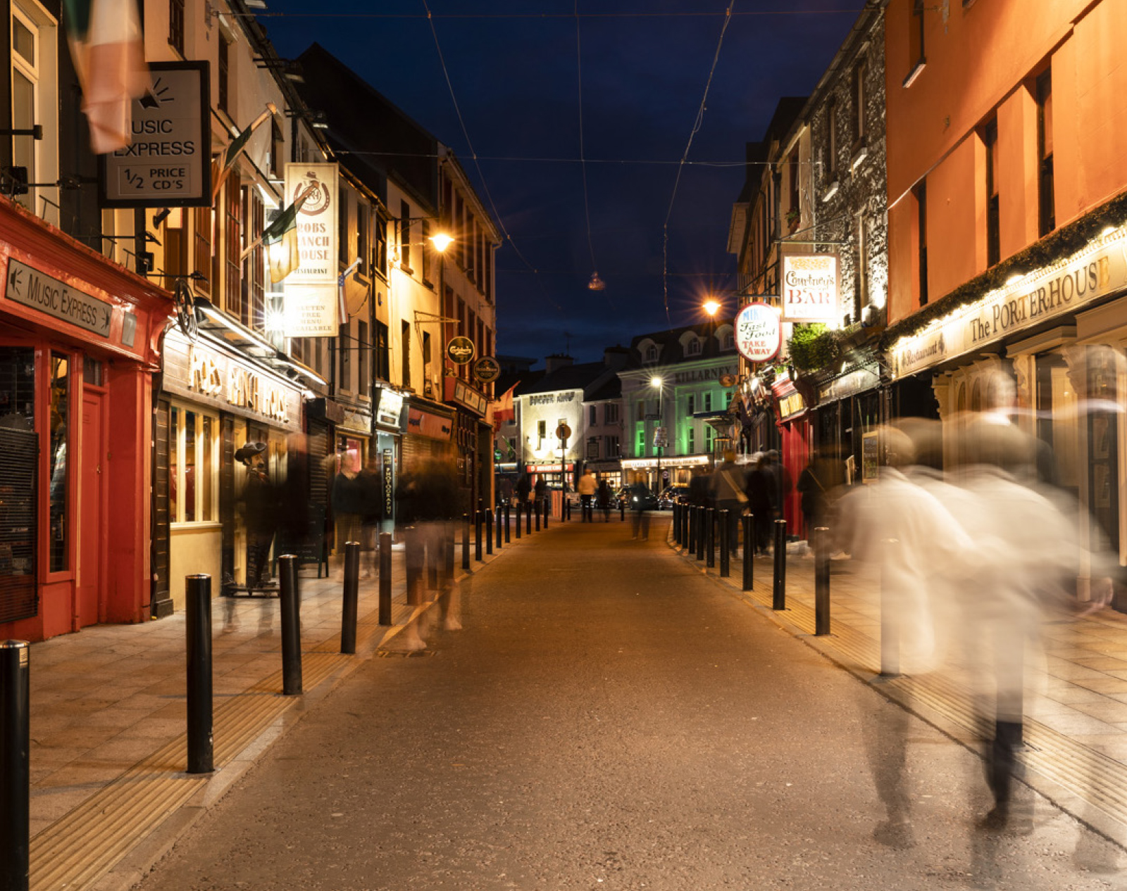
Following an in-depth audit, both desk & on-site research and looking at local and global competition we identified that the Killarney Park Hotel had a unique set of ingredients. It's not only acclaimed for its friendly staff and warm visitor experience and Leading Hotel of the World status, it's a retreat where old world elegance meets modern day luxury, all in a central town location with the glorious Kingdom of Kerry on its doorstep. The real opportunity here was to communicate its truly immersive experience, something people seek again and again, a five star hotel like no other.
Unity & Diversity
As part of the repositioning, we renamed this luxury hotel as The Killarney Park. This accentuates its premium feel and authenticity and helps create an identity that carries the brand successfully forward. We also needed to build a relationship with its sister hotel The Ross to help cross sell services. The Killarney Park has a certain intimacy and impeccable service. Knowledge and know-how are intrinsic to its DNA. The Ross is a boutique hotel which embraces a thoroughly modern attitude and lively atmosphere. Both brands now have their own distinct voice, look and feel, yet can live comfortably together too.
Carefully Crafted
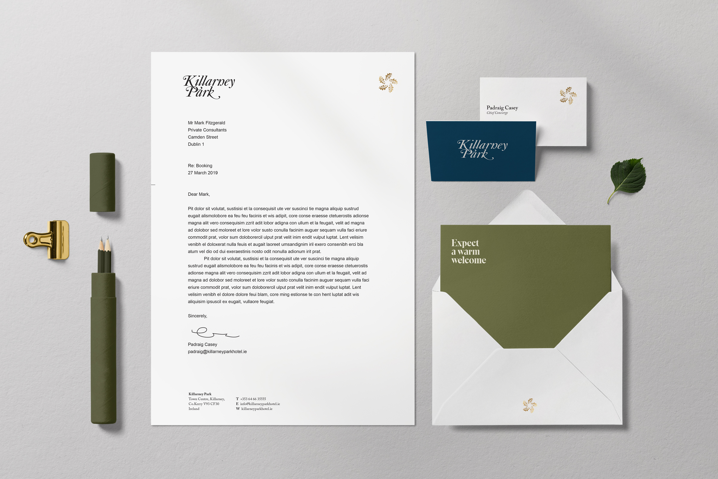
The Killarney Park is truly a timeless example of superlative service, delivered with genuine warmth. The new carefully crafted logotype needed to accentuate these personal qualities to help project the correct tone of voice. It is based on classic calligraphic penmenship, is unique, distinct and expresses a timelessness with the utmost clarity.
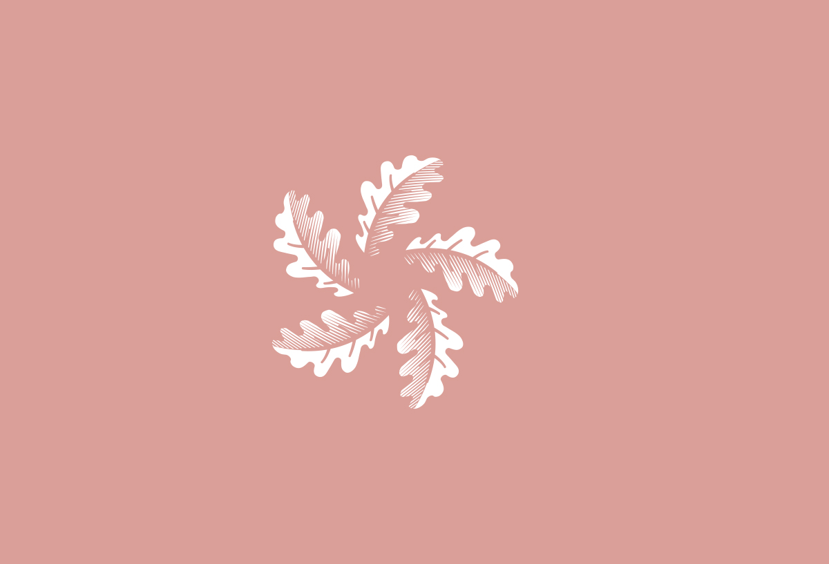
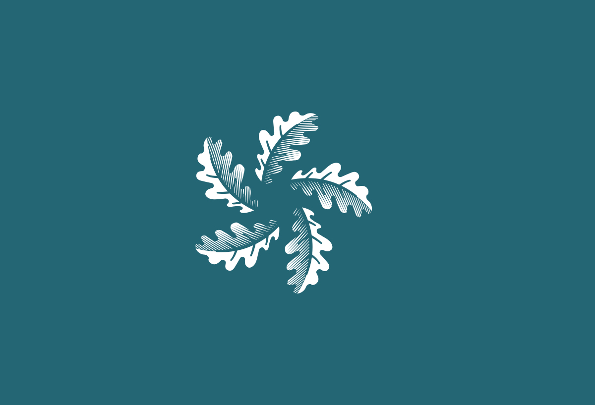
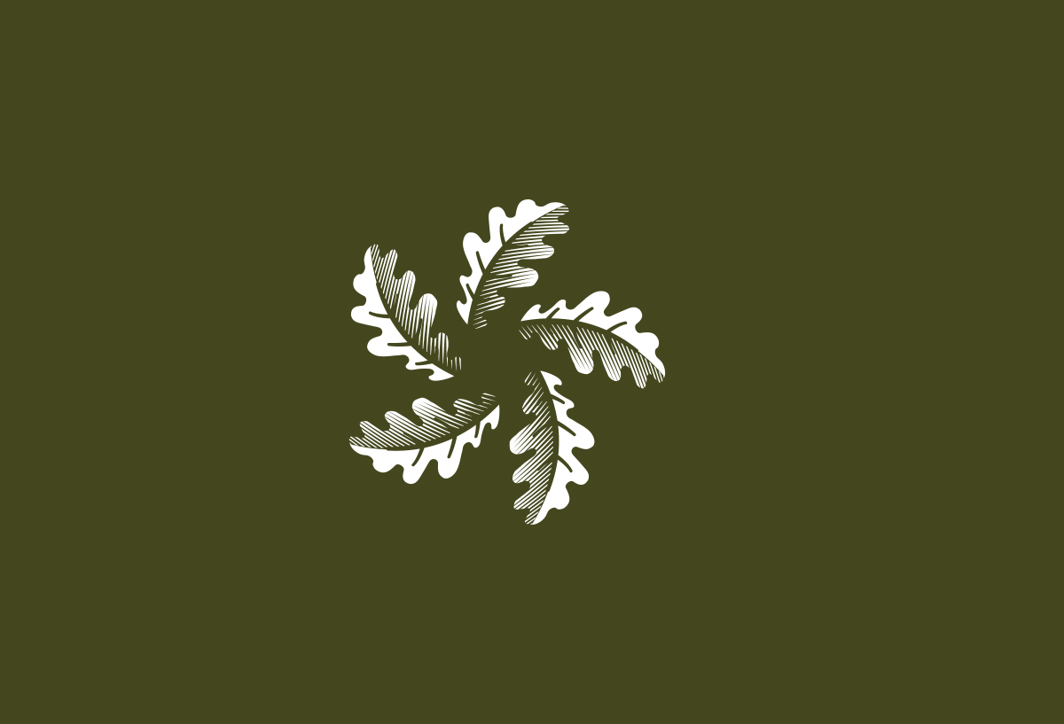
A Symbol of Unity
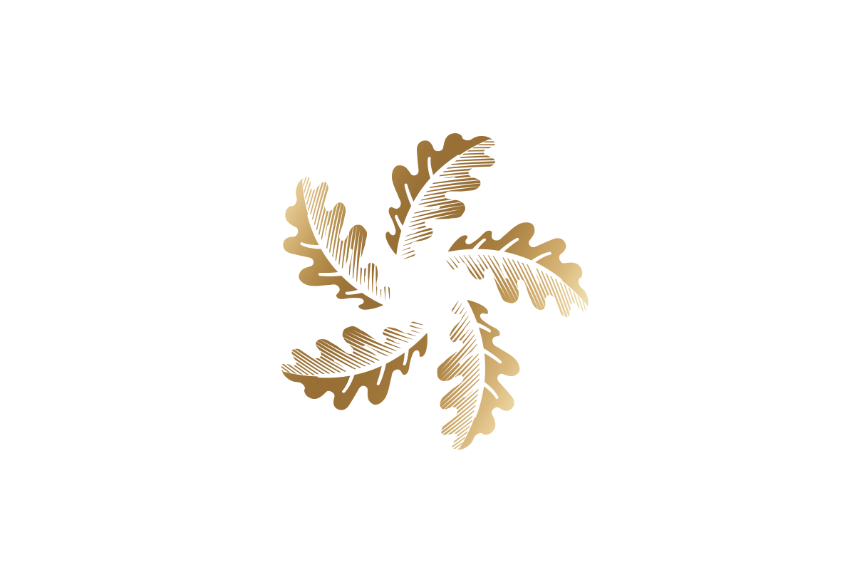
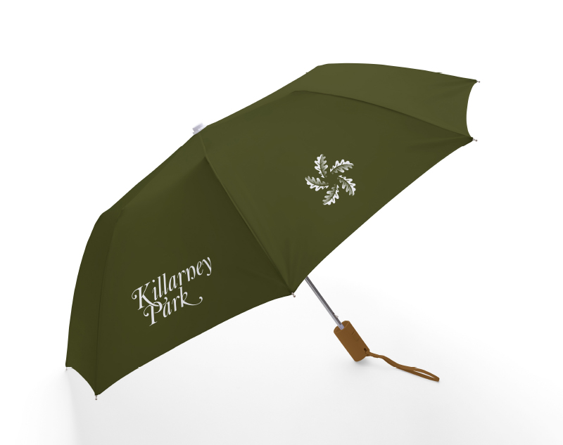
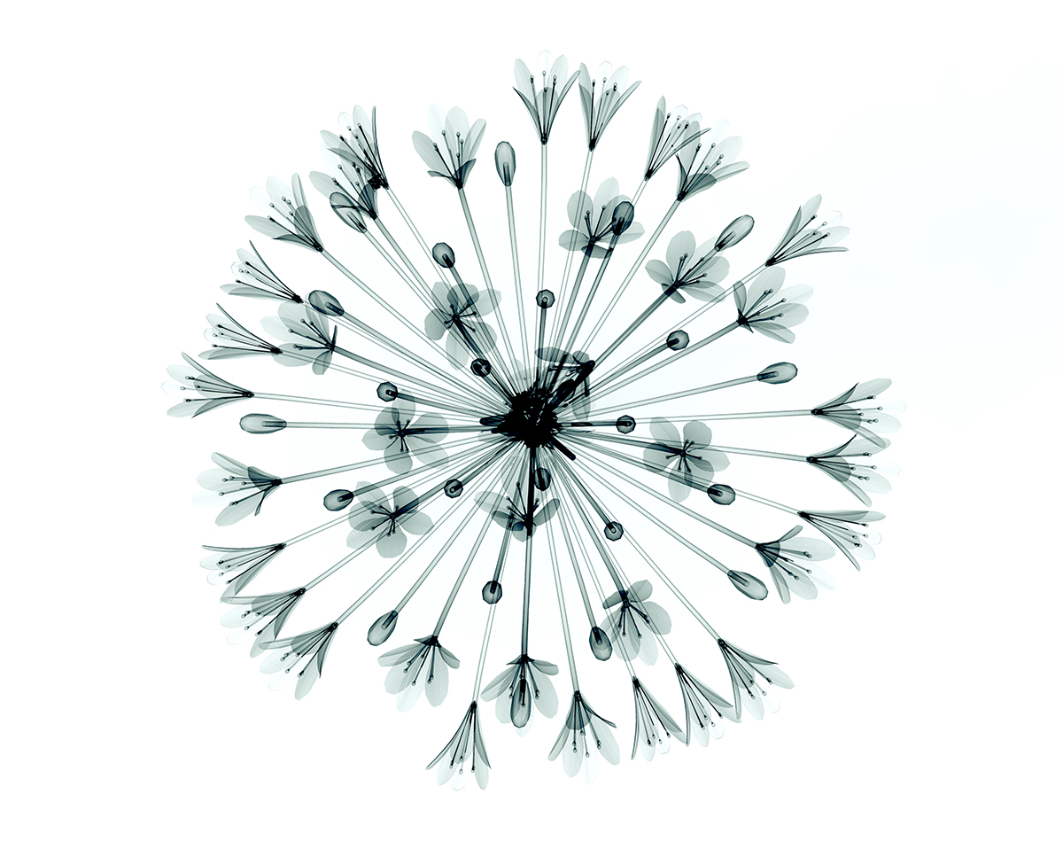
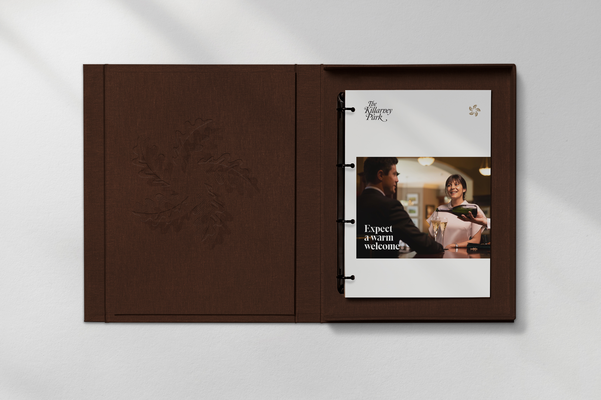
Killarney is a lush and forested landscape and on the hotel grounds is a large oak tree which formerly formed part of the hotels identity. Evolving and expanding out the nature theme, the icon has a connection with the past, a connection to the landscape and a connection to the National Park. It's 5 leaves reflect its family heritage with each leaf representing an individual family member and of course the world-class 5 star status.


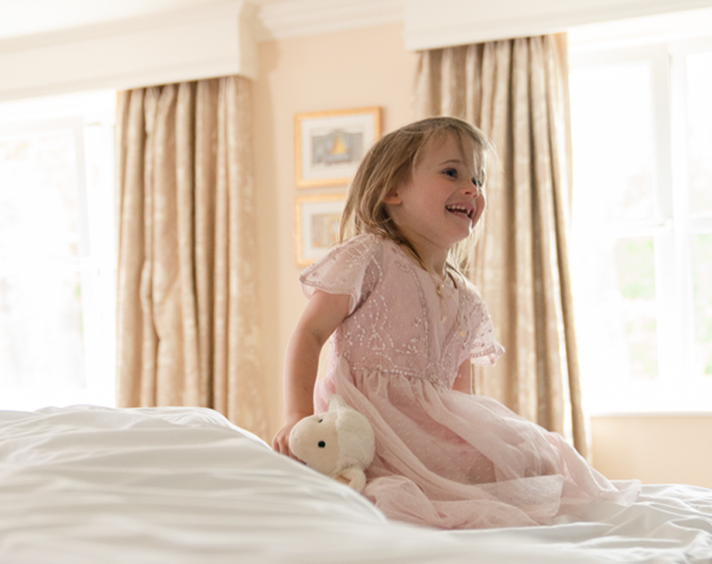
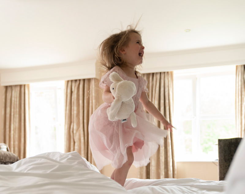

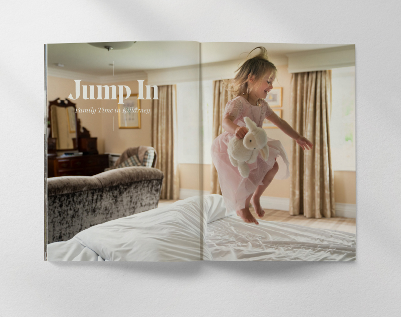
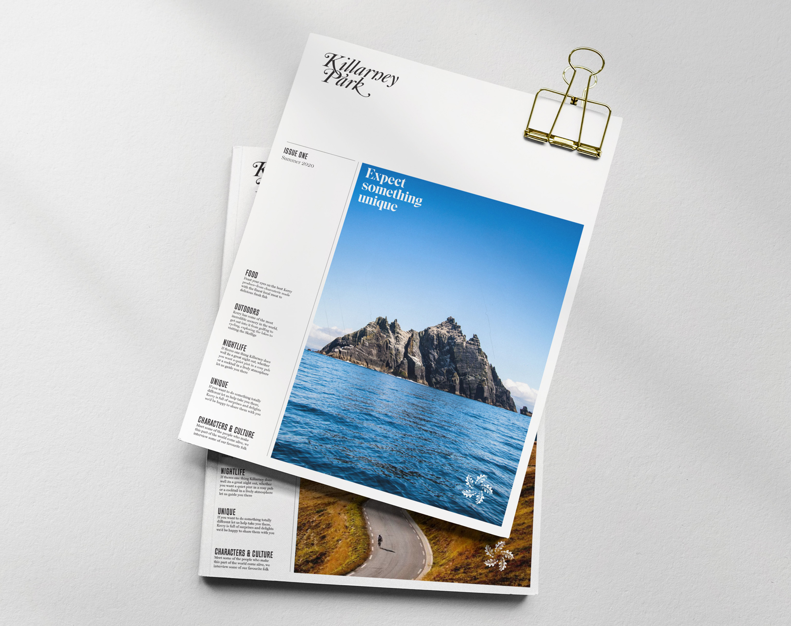
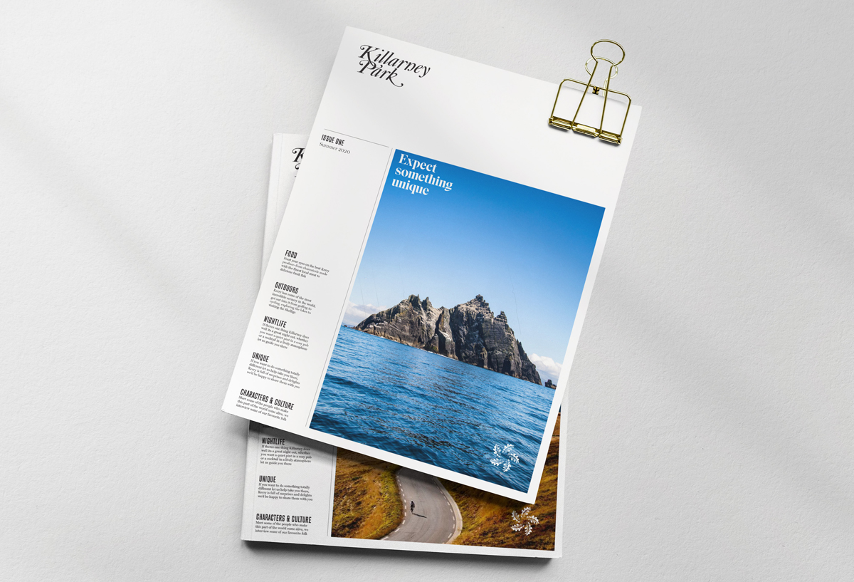
Hand crafted calligraphy, an authentic engaging tone of voice together with photography that celebrates all that Killarney has to offer, the new visual language is full of warmth and brings to life the raw beauty and the uniqueness of the Killarney Park and its natural environment.
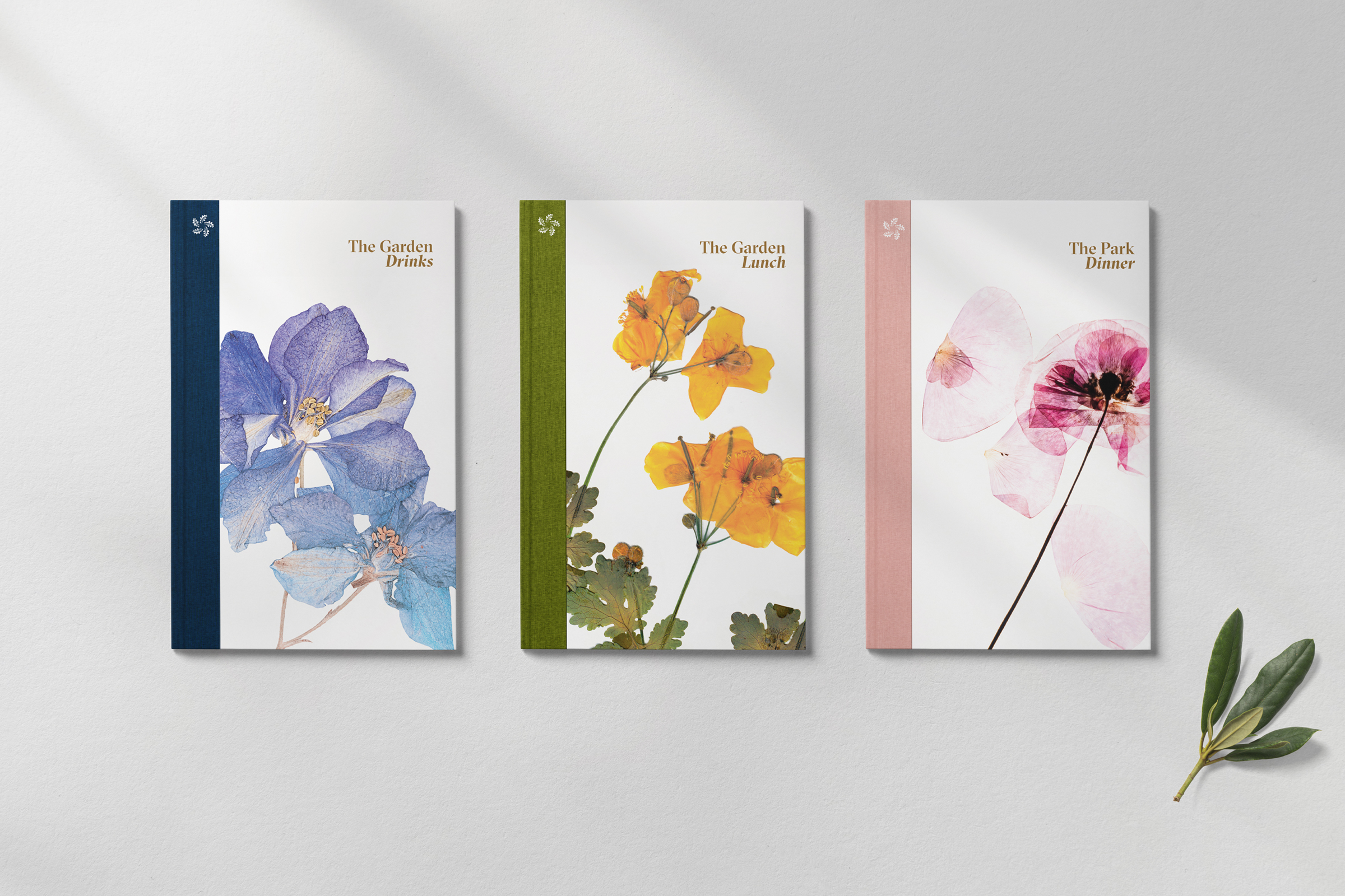
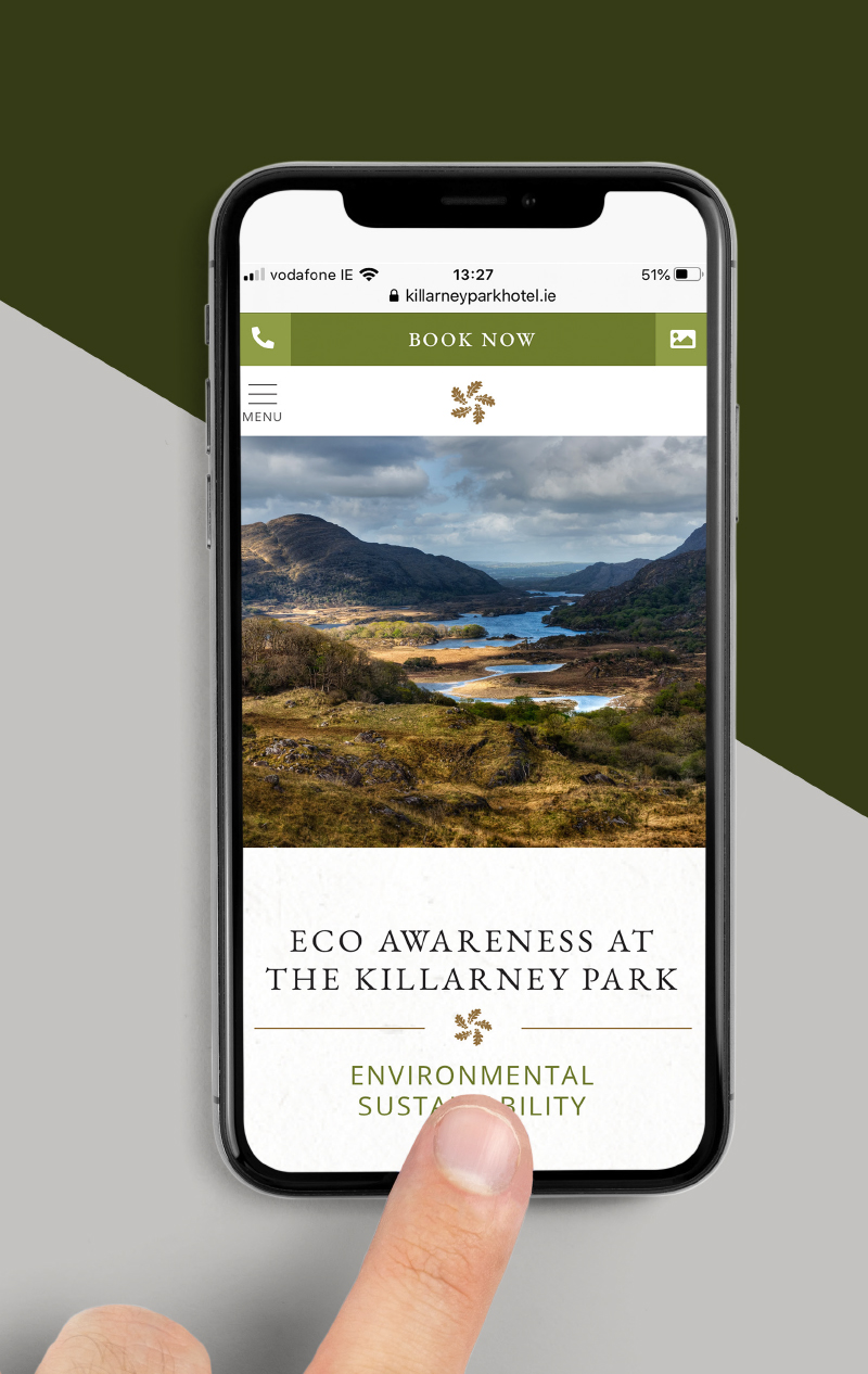
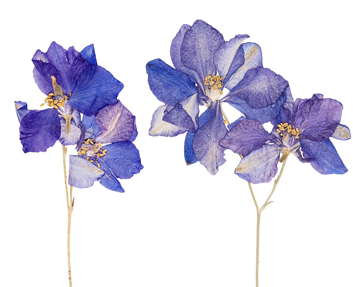
Colour is an essential feature of the revitalised brand and plays a major role in building awareness and recognition. Inspired by the stunning surrounding landscape, its warm, natural and authentic. Natural plant life and wild flowers are celebrated throughout printed communications and form hero images for the Hotel's Park Restaurant and Garden Bar.

An exceptional hotel now has its exceptional story shared. A revitalised brand that projects an authentic immersive experience, layers of meaning and rich association. This truly taps into The Killarney Park's real difference and customer experience that brings visitors back again and again from around the world.
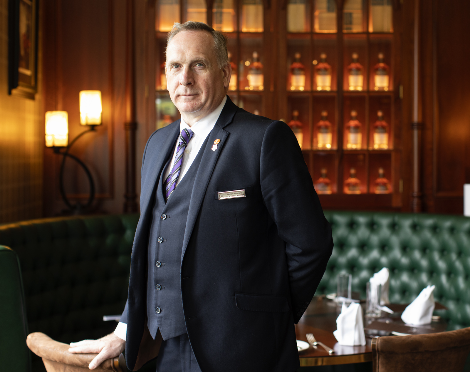
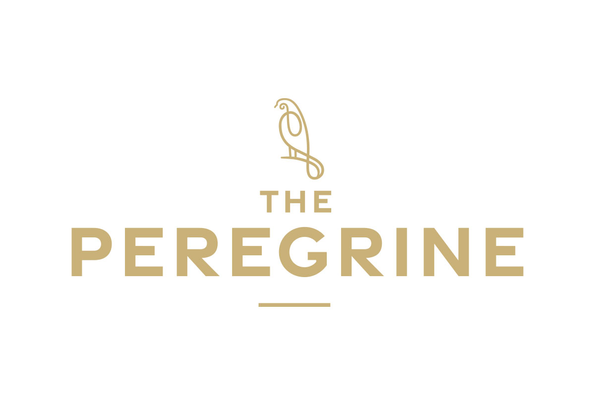
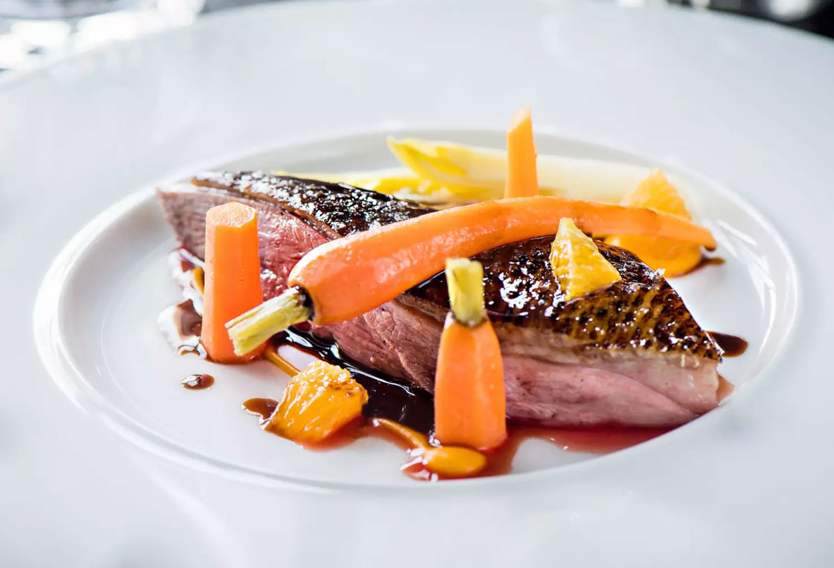
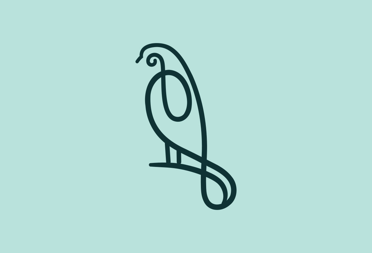
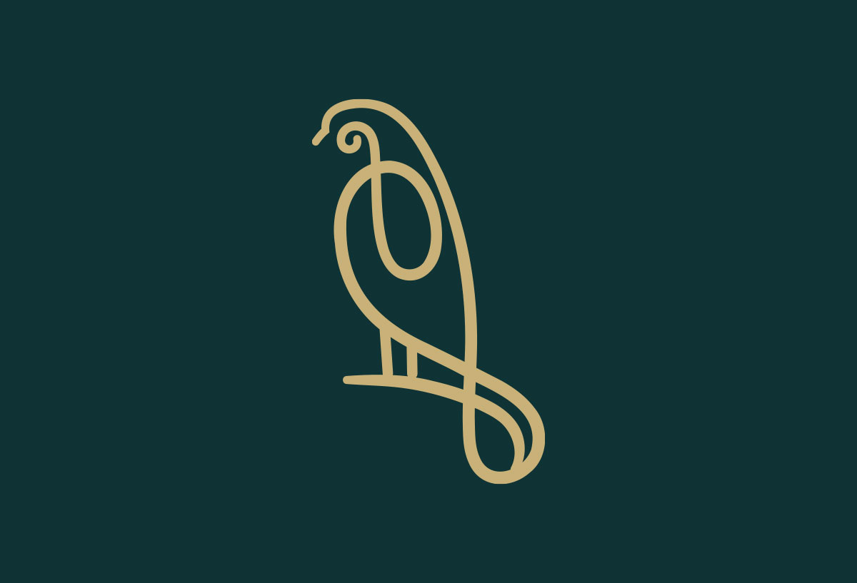
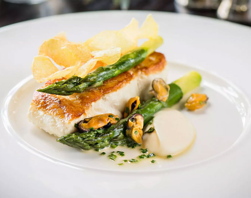
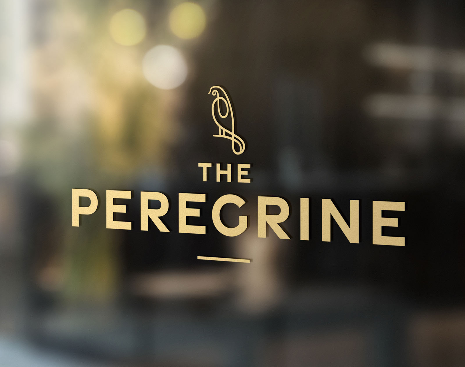
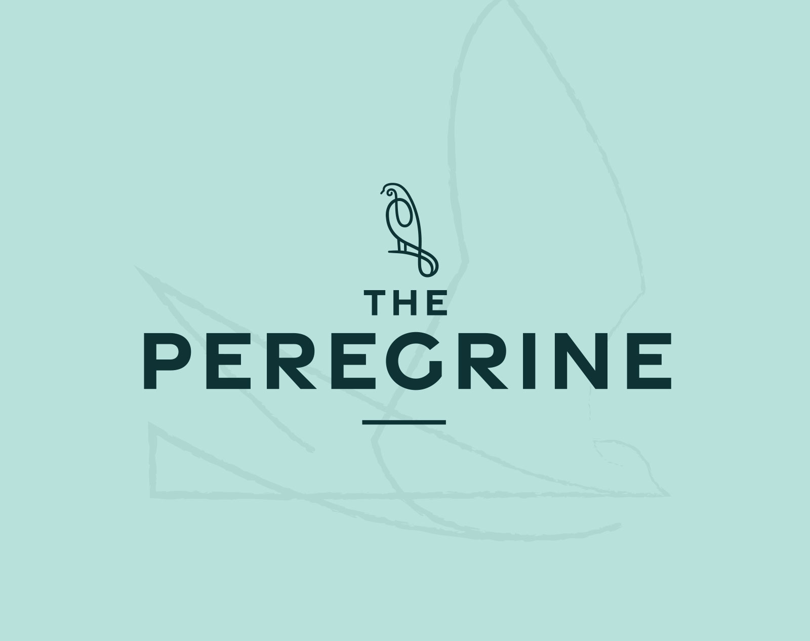
The Peregrine Restaurant
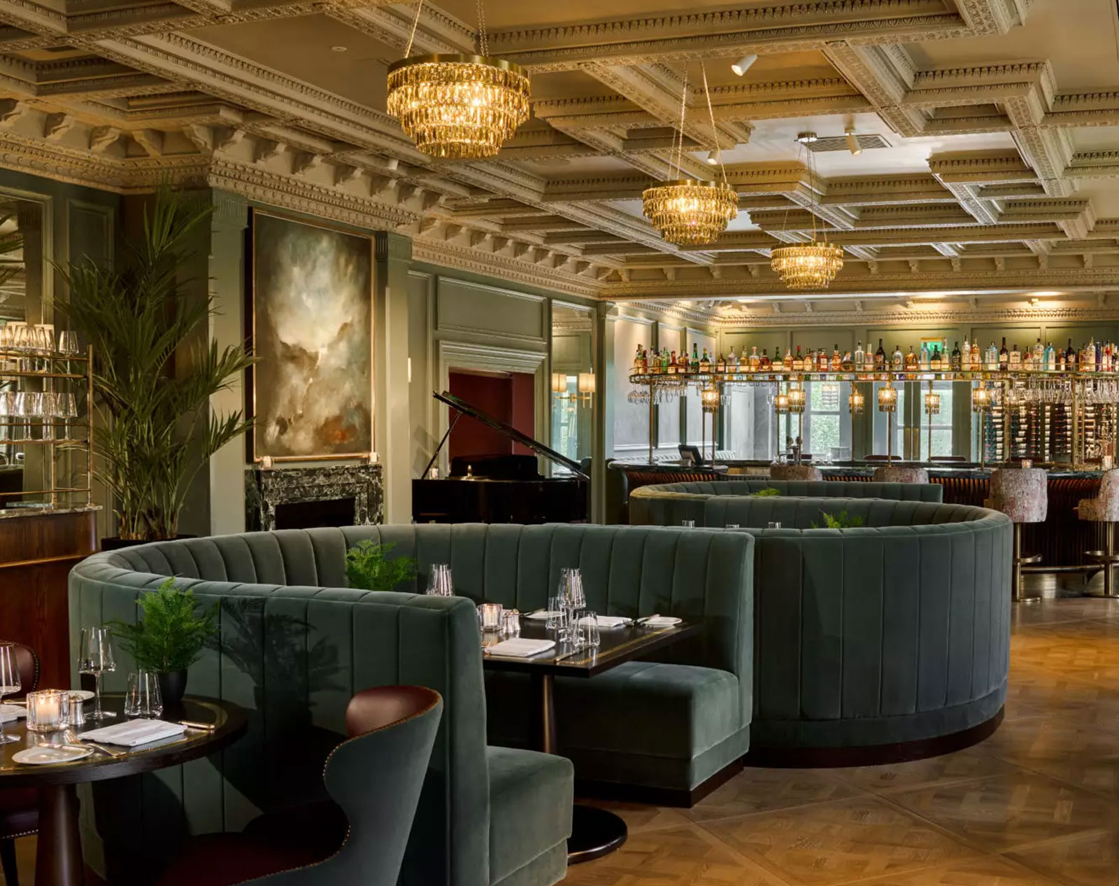
The Killarney Park has extended its five-star offering with a new standalone fine dining experience. The overarching ambition for the space was to welcome one and all introducing an authentic experience that will make a name for itself locally and beyond. We needed to develop a brand with a unique name that defined its ambition, helping to build that buzz and ultimately its success.
To craft a new name, we drew inspiration from the foundational elements inherent in the Masterbrand, specifically, Killarney's unique and captivating natural surroundings. We named it after the Peregrine, the magnificent raptor that graces both the grounds and skies of Killarney National Park. Working closely with the interior designers throughout, ensured a seamless fusion of brand elements and interiors, resulting in a harmoniously streamlined identity and a hand-painted mural in the restaurant depicting the landscape, complete with a Peregrine soaring high above.
The new identity even extended its influence to shape the cocktail menu, culminating in a distinctive and unparalleled experience at the heart of Killarney.


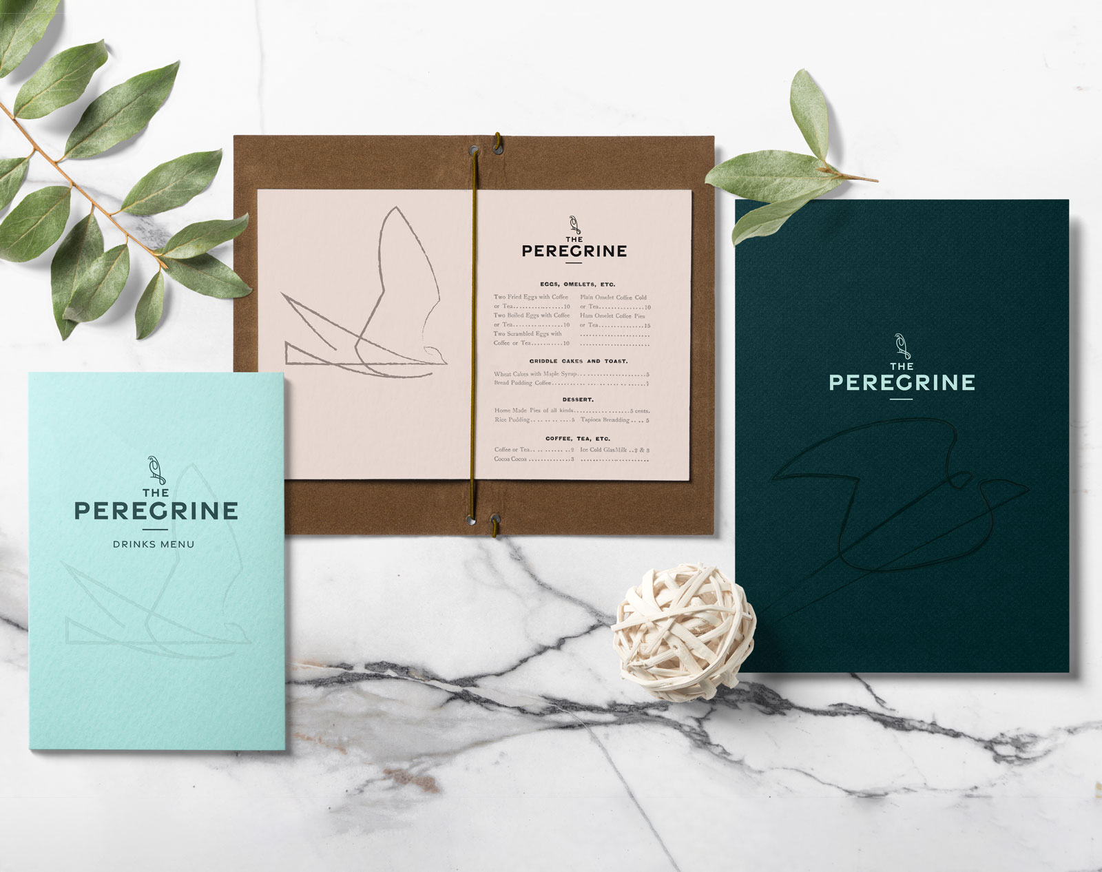
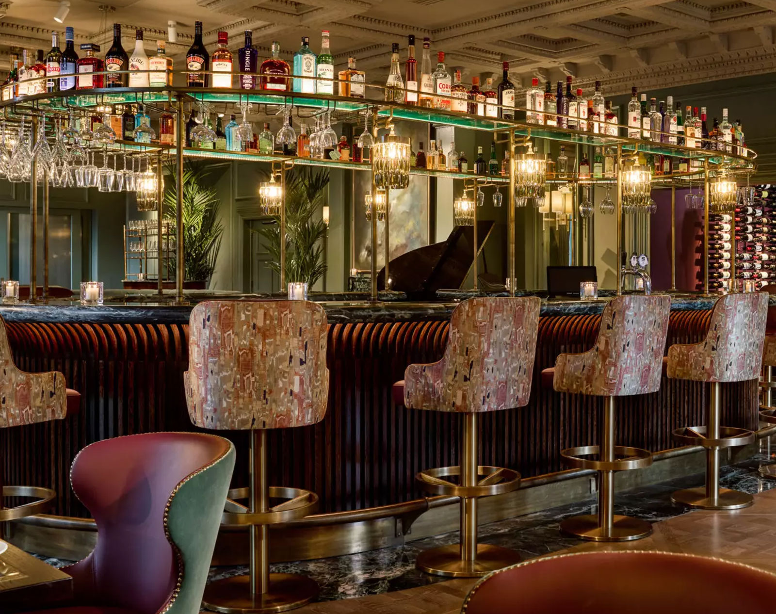
Every element has been crafted to display a unique vision, every touchpoint has been examined for its potential to make a connection. Design as detailed as a 5 star hotel.
Alkamee brought The Ross and The Killarney Park on a very exciting adventure in our rebrand. Their fresh and creative style was exactly what our business needed and they understood our product and its potential by really getting under our skin. Our new brand certainly reflects our personality and vision for our business and we are delighted with the end result.


